Guy Cool - Sketch #59: Dark

This is my current iteration here :smiley:

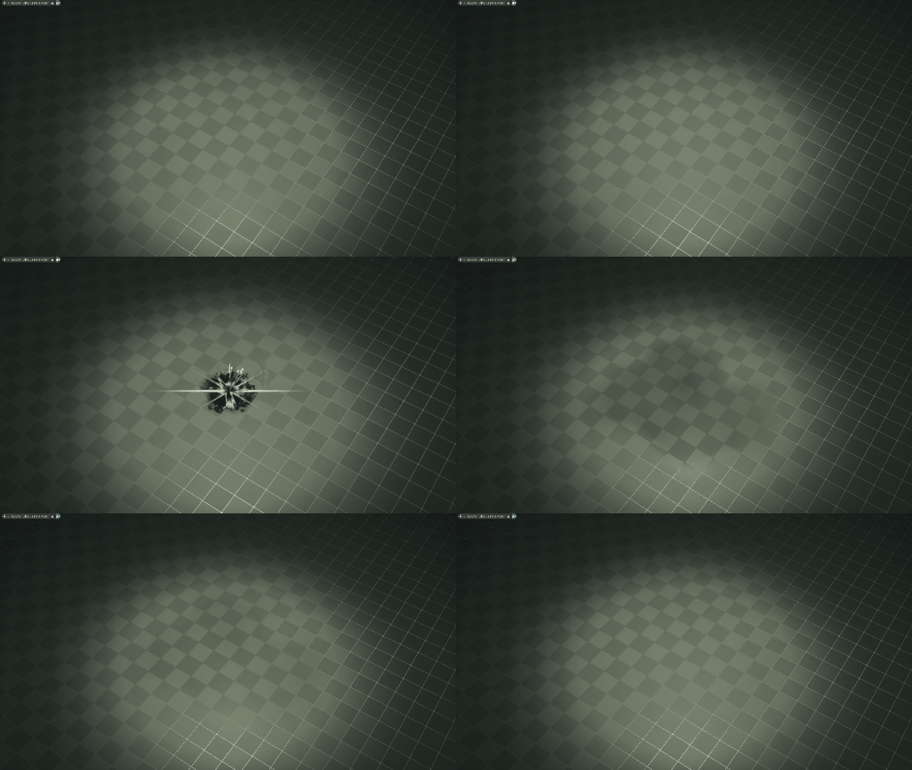
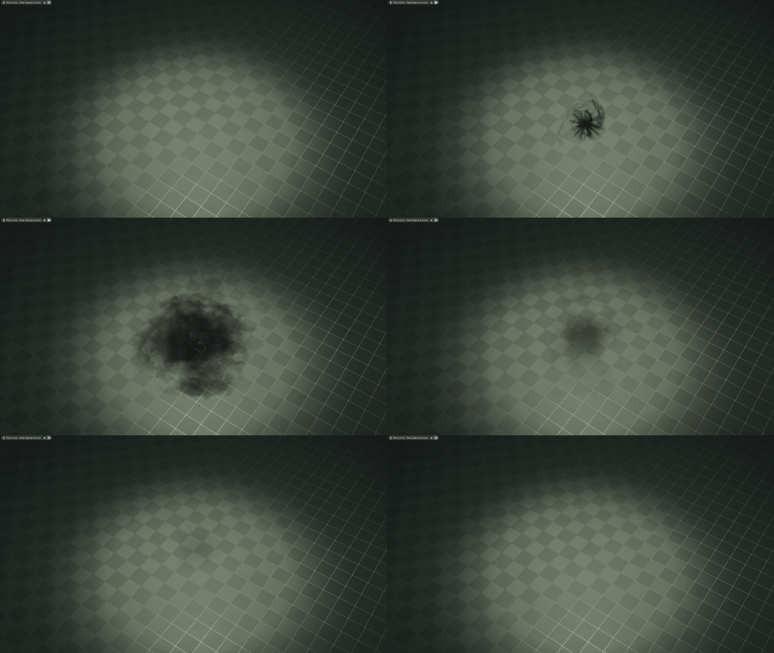
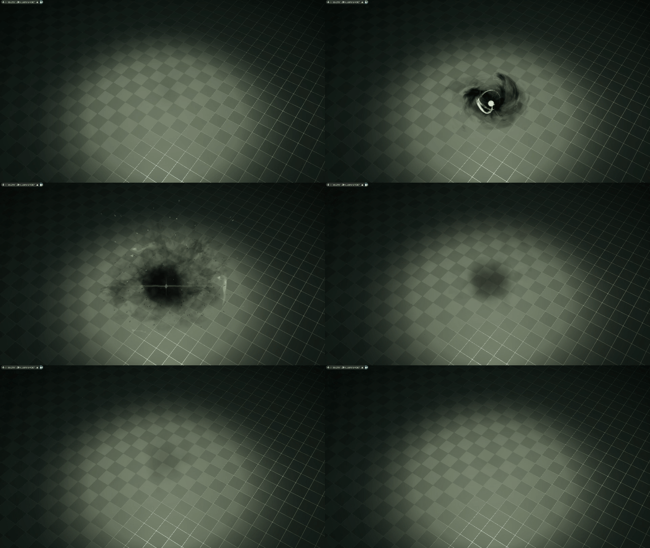
DarkBlast_small_v3

8 Likes

Here is a youtube link for higher quality :smiley:

2 Likes

A cool little sprite debris atlas I made: https://www.youtube.com/watch?v=UiiKH4Jo1GU

A mesh swipe tool I made to get that inward collapse feeling in the build up: https://www.youtube.com/watch?v=N7X1-Pvmkyg

1 Like

Terrifying! Love it :smiley:
I kind of have a feeling the smoke at the end last for too long or doesn’t slow down enough (panning).

Made some edits!

  • swirl radius on the ground on the charge up to make it clearer what the AOE will be
  • Increased the size of the swirl mesh swipes and thinned them out to make them read more individually
  • included a hard edged core to show the energy was going somewhere
  • removed flare distortion bc although it looked cool, it didn’t fit the style of photoreal
  • edited the fov settle slightly to make it a bit bouncier
  • added some more color with debris bits, core, colored mesh swipes, and AOE ring
  • added thin ring to show the damage AOE more clearly
  • reimplemented my screen flash to use post process because my translucent particle solution with scene color couldn’t access translucent colors
  • shortened the radial ground texture’s lifetime to stop it being so flat and radial at the end.

Here’s another vid:

4 Likes

Thank you for the feedback! I implemented it in my new version :grin:

1 Like

Progress gifs

DarkBlast_small_v1
DarkBlast_small_v2
DarkBlast_small_v3

2 Likes

So much better! Keep up the amazing work :3

For me the fullscreen white flash feels slightly disconnected, might be cool to just have it at 80% opacity or adjust to brightest color in scene ( ~ rgb 200, 220, 200)

1 Like

Version 3! I don’t want to write all the changes because I am sleepy haha. I didn’t implement everything because some points were good for the effect but didn’t match the vision. Thanks to everyone who gave feedback!

1 Like