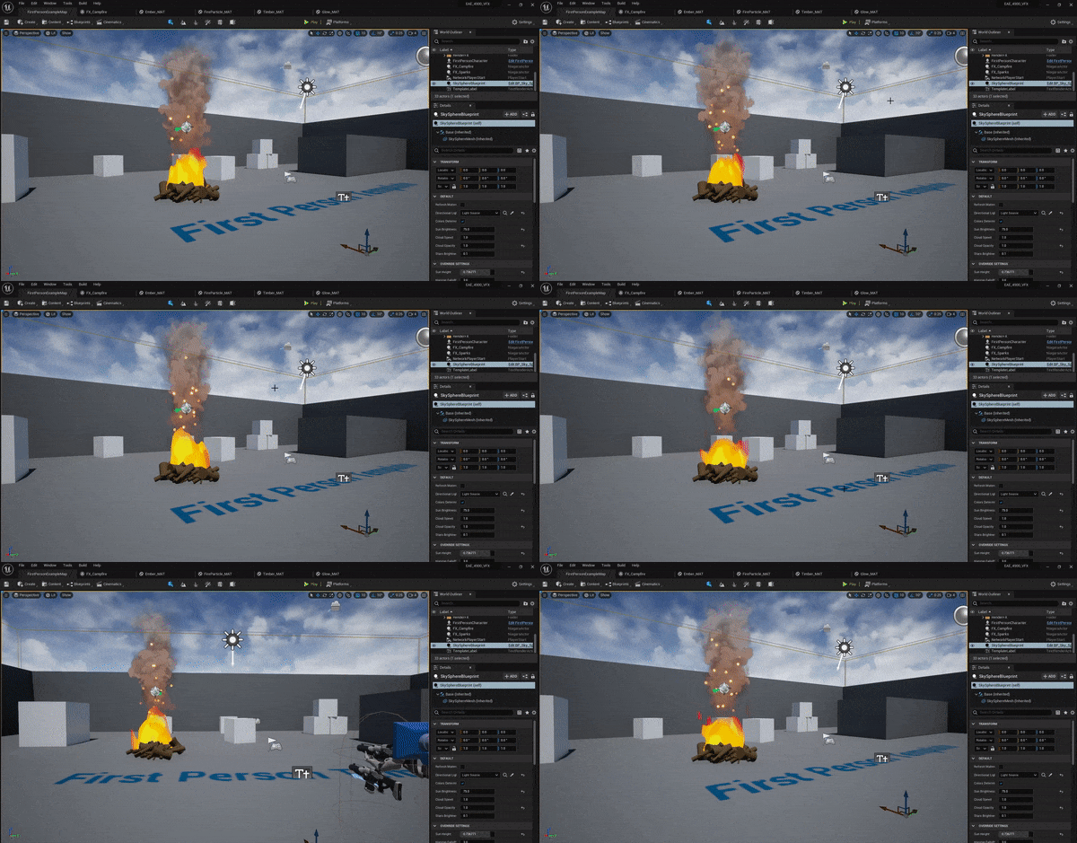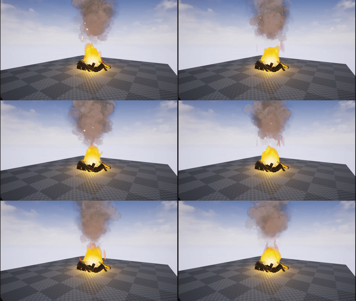
This is my first take at VFX! Constructive criticism and areas that I can improve are greatly appreciated, as I do not have much experience with this. I would post a gif of the details but I’m too new of a user.

This is my first take at VFX! Constructive criticism and areas that I can improve are greatly appreciated, as I do not have much experience with this. I would post a gif of the details but I’m too new of a user.

Here’s the details .gif I mentioned in the main post.
I think it’s a good start, color palette and shapes work well!
Looking forward to your final result ![]()
Maybe you’re asking for something more technical, but I think I would lower the smoke (either directly lower the emmiter you already have or make a new one at the bottom with less particles and wider) cause all the fire should produce smoke and now it looks like just the top of it is doing it. Also, making the fire brighter in some points towards the middle could help making it look more “hot”. I’m still a junior tho, so if someone wants to correct me go ahead ![]()
I appreciate the reply! I’m gonna give these changes a whirl, I really appreciate the feedback, it helps me learn!
You make a really good point! I’ll definitely try these changes our. I have some ideas as to how to implement them.
Here’s the final version! I added most all of what was suggested and I think it removed a lot of the flatness that was originally there.

It looks better! ![]()