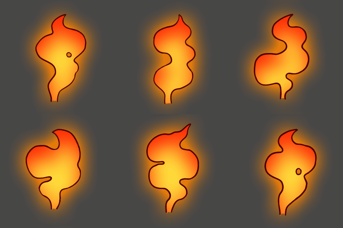
Guillermo Couceiro - VFX Sketchbook

Thumbnail:
index
Hi everyone!

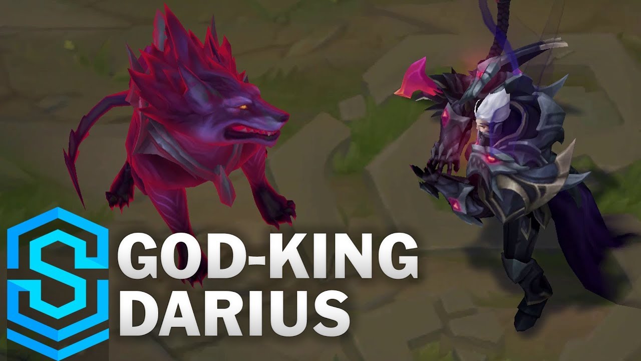
While I’ve not participated in May’s VFX Sketch, I’ve been looking at your work and references and I’ve tinkered a bit in unreal and unity this past weekend. I want to try some of the stufff I’ve seen around so I’m working on a custom VFX for Darius’ circular attack from League of Legends. I’ve played this character a lot and this ability always feels very satisfying to use for some reason:

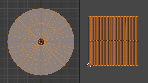
I’ve started with a circular warping effect. The mesh used for this is just a disc with the UV representing the polar coordinates around the center:

It’s been some time since I’ve worked in Unity so making the refraction work was kind of a headache with all of the new changes with the URP/HDRP, the Shader Graph, etc. I’ve ended up warping the SceneColor around the center, following the motion of the axe

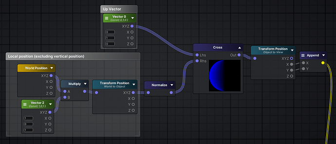
To do this I first calculate the cross product between the up vector and the local position vector to get the direction around the center for each pixel. This direction is in object space so it has to be transformed into View space for the next step:

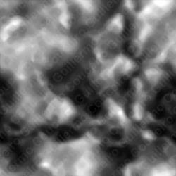
The result of the previous image is multiplied with a noise texture, a “Strength” parameter and a mask texture to limit the area in the mesh where the warp will be seen.

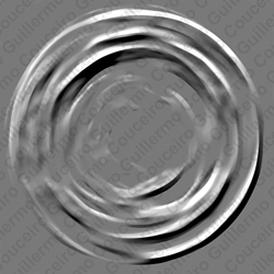
Noise texture:


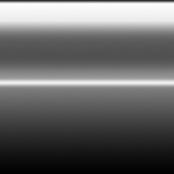
Mask texture:

The resulting value of all this is then added to the screen position and used to sample the scene color:

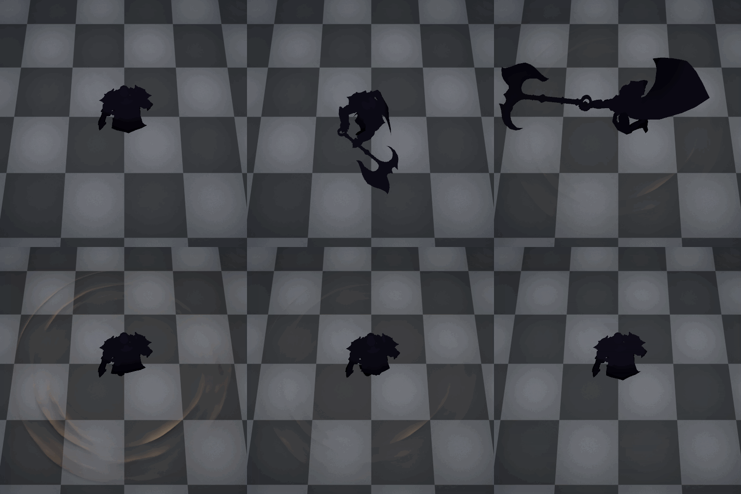
This is the resulting effect after animating the material properties
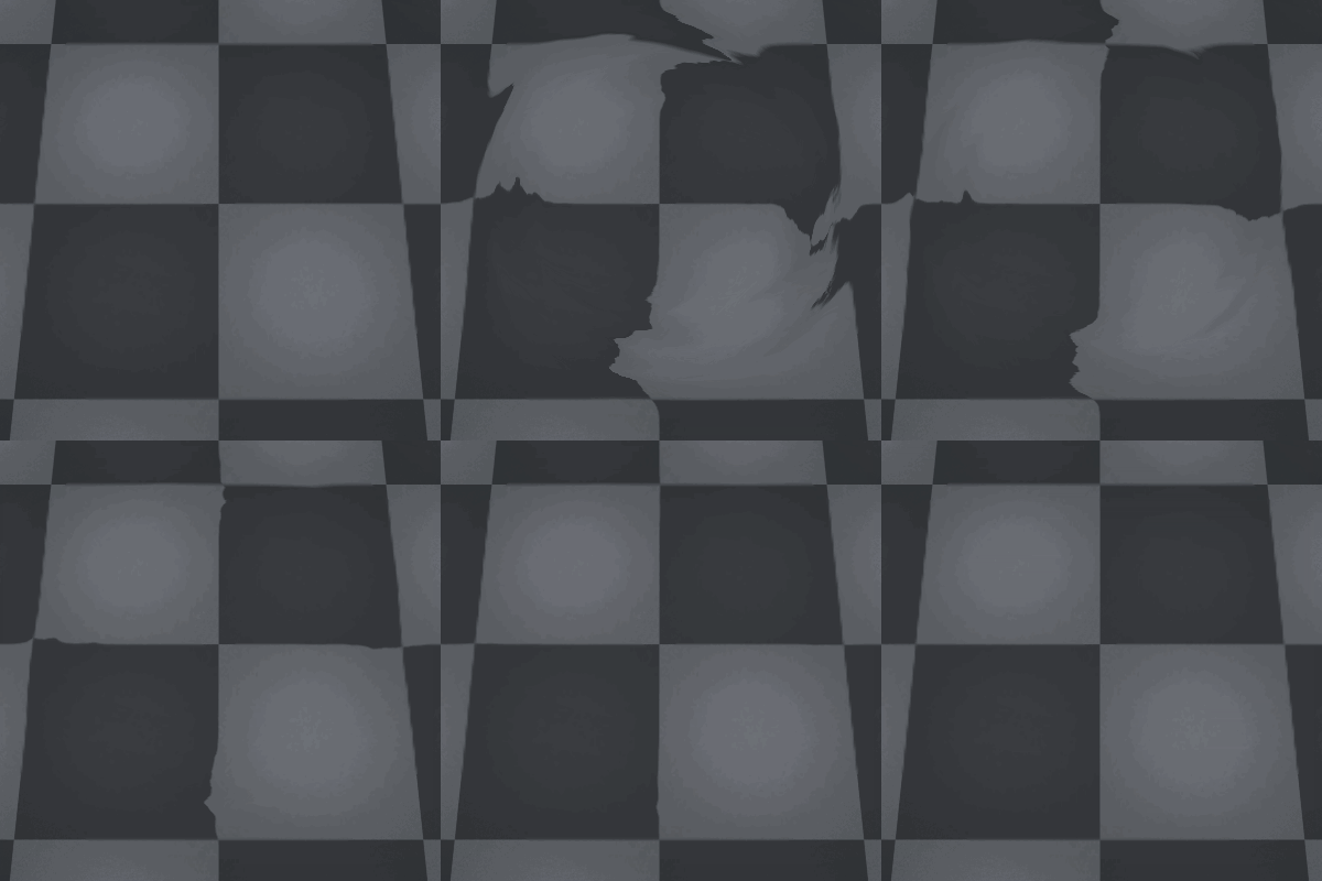
warp_60

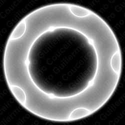
For the area indicator I’ve used a circular texture generated in Substance Designer from a horizontal tiling pattern:

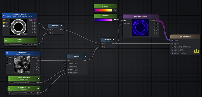
The material is more simple, the texture is multiplied with the same noise mask from the warp with some parameters that allow animating a fade in/out. This is used both as the alpha and as the value to sample a color gradient:

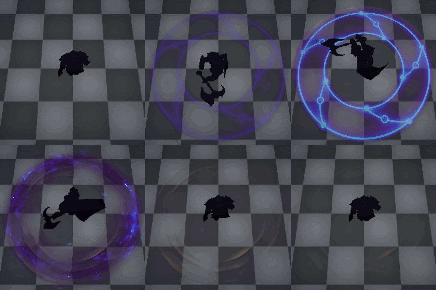
Animating both materials acordingly to the ability’s timing:
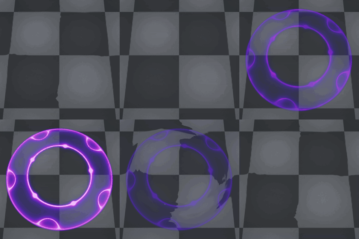
test_60_2

The circular texture might be too bright for the final effect since it mostly works as an indicator, but I’ll tweak that when the weapon swipe and additional components of the effect are in place.

And that’s where I’m at right now, I’ll keep posting the rest of this and other VFX in this thread as I work on them. See you around! :smiley:

23 Likes

Thank you for the great tutorial. :smiley: :smiley:

3 Likes

vfx1

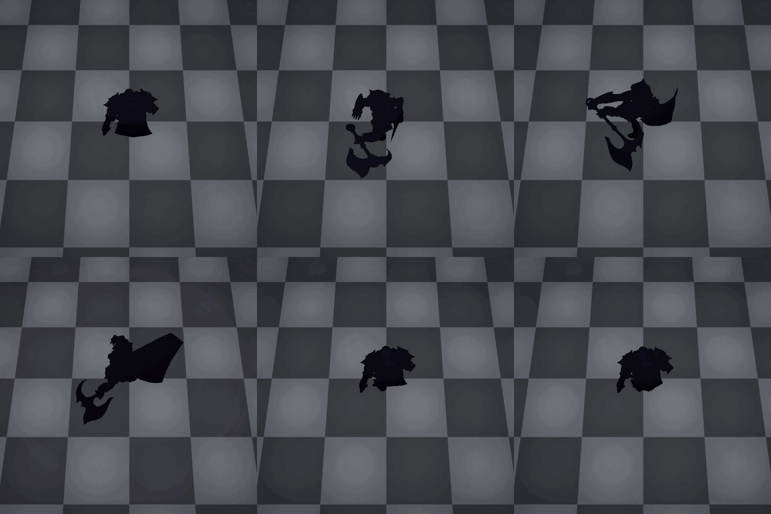
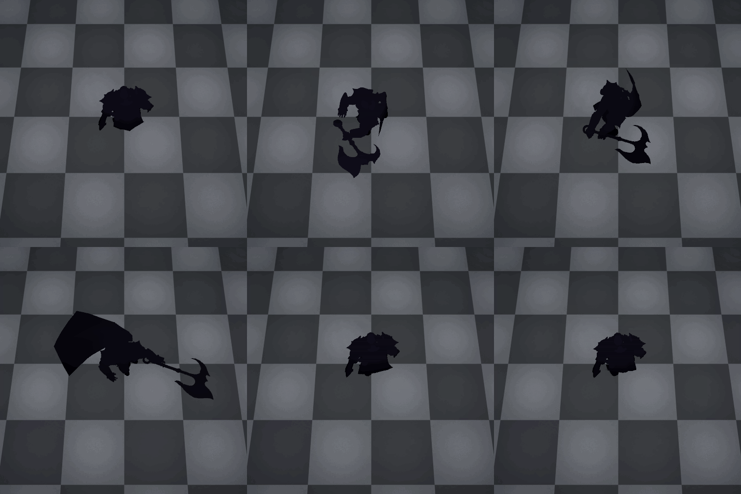
I’ve worked on the rest of the effect and I’ve added the character model and animation. I’ve also changed the ability indicator texture and the color palette. I’ve tried to go for a “cosmic darius” style, with the nebula and star textures following the motion of the blade.

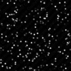
The Nebulous trail is made with a a combination of the same noise used in the warping and a stars texture. The material is applied to the same circular mesh
vfx_smoke

The ground scrapes left after the attack use the following texture with a gradient applied to it. The material also uses the same noise to control the irregular fading in and out.
vfx_scrapes

The blue edge reinforces the ability range and gives some oompf to the impact frames. I used a texture to mask the colors because I was tweaking the shape a little bit but now that I’m happy with the results I should probably create a new circular mesh that uses vertex color to mask the effect instead of adding another texture to the pack.
vfx_edge

I tried to add some contrast color with the golden weapon trail, although I’m not so sure about the result so I might tweak the color a bit. It uses a similar mask to the blue edge.
vfx_trail

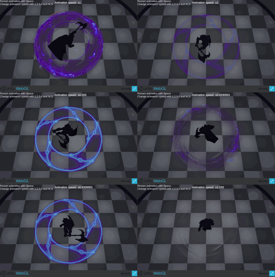
The gifs are not the best way to showcase visual effects so I’ve uploaded a webGL version of the unity scene I’m using to scrub around the effect and animations.

webgl_build

You can run the VFX on your browser and play with the animation speed in this WebGL build:

22 Likes

Wow that’s so awesome, great job!

You did fantastic work with the colours. That complementary colour scheme of yellow and purple works really well, with those deep purple alpha blends giving a lot of really rich saturation, and your decal very clearly communicates the danger area.

If I could give one piece of constructive feedback it would be to try varying the line weight of the lines of your decal, to make more variation to add visual depth.

Fantastic work!

2 Likes

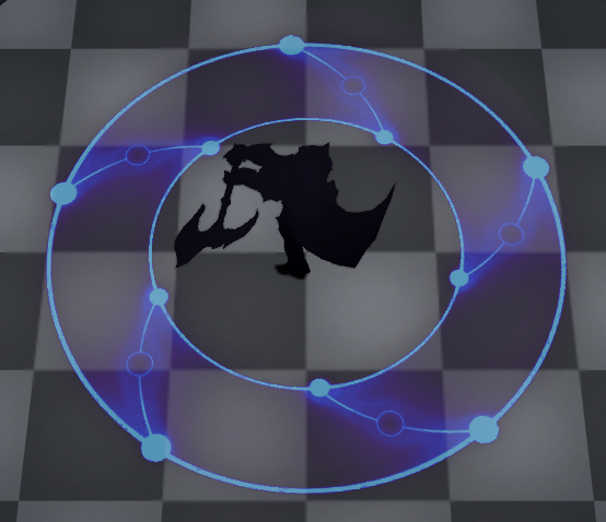
Thanks for the feedback! Yes, that point about the lines makes a lot of sense. I’ve tweaked it a bit and tried to give more weight to the more meaningful lines gameplay-wise.

imagen

I’m not in love with the decal texture but I think I’ll leave it be for now while I work in the rest of the abilities and might revisit it later.

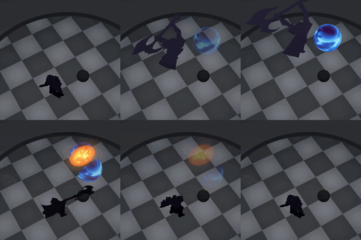
I’ve also started to work in the ultimate effect, I’ve thought about a world destroyer kind of fantasy so I’ve worked on animating a planet being split in half without no effects yet.
vfx_R

3 Likes

Currently working on the VFX Apprentice courses, i’ll upload here some of my sketches and studies:

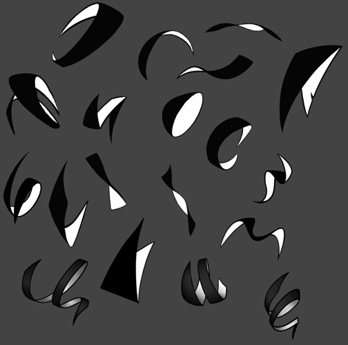
Exploring curve shapes and 3D ribbons:

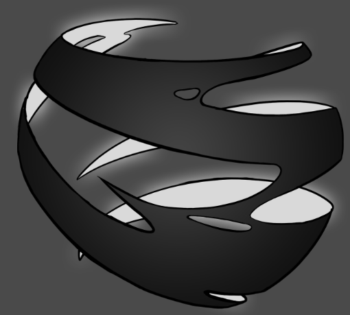
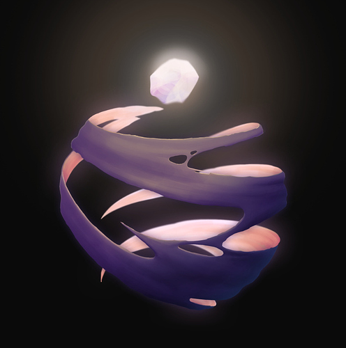
One attempt to do something similar to the Wisp Concept from the course, kinda derailed from the reference but still a good practice…

Blocking:
imagen

Fully rendered:

1 Like

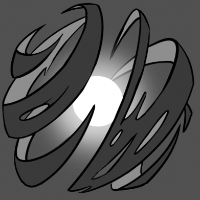
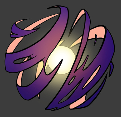
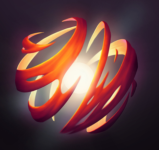
Some more spherical concepts…
imagen


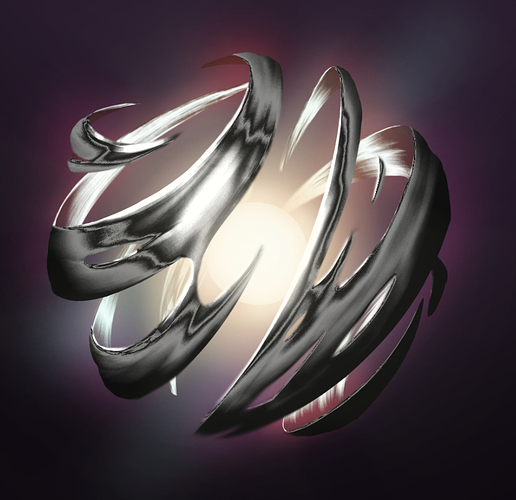
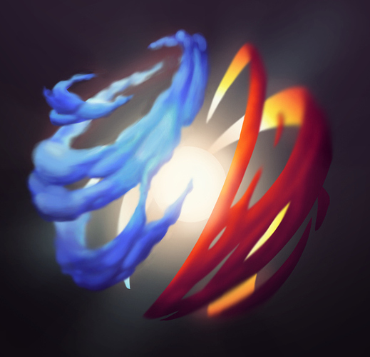
Playing with different materials

Testing a more smokey, billowy rendering…

I’m going to try and practice more smokey and “magic” shapes instead of the solid, flatter ones I always end up steering towards.

7 Likes

Working on some electric elements

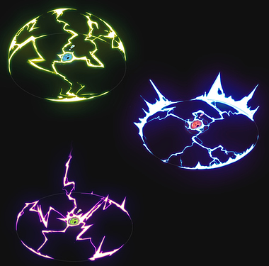
Thumbnails for different electric area effects:

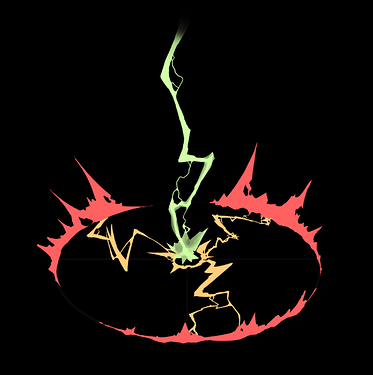
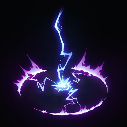
Initial concept sketch:

Final concept:

2 Likes

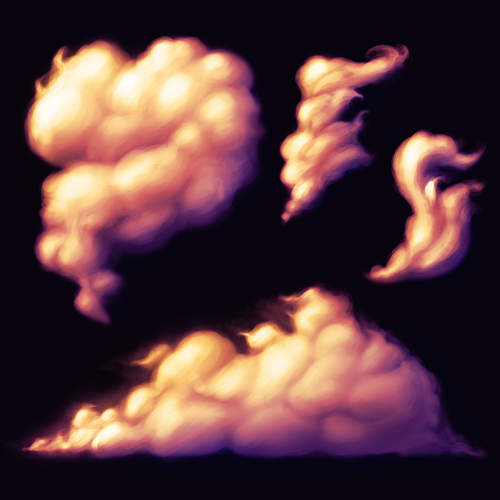
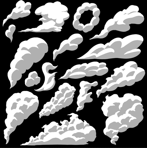
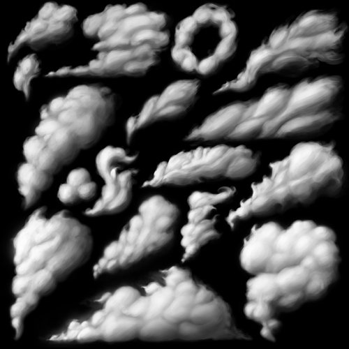
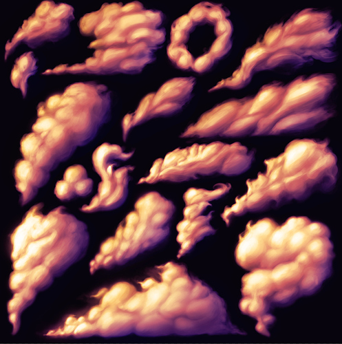
This week I’ve been studying smoke and cloudy shapes, since I’ve been struggling with them since the start of my 2D journey. In my opinion these are the most interesting from the batch:

Shape studies:

Shading and texturing:

Color:

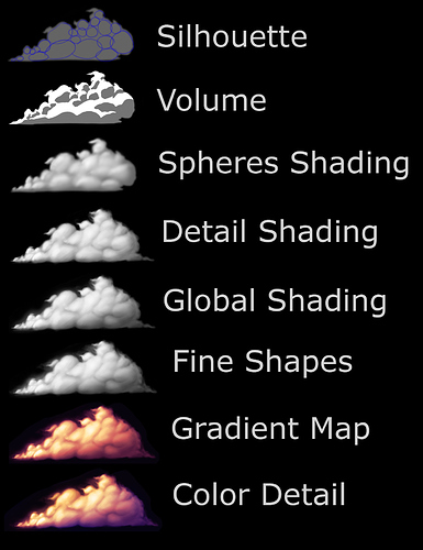
I made a diagram of the whole process I ended up with, since I know otherwise I’m going to forget everything between now and next time I need to draw these kind of shapes…

10 Likes

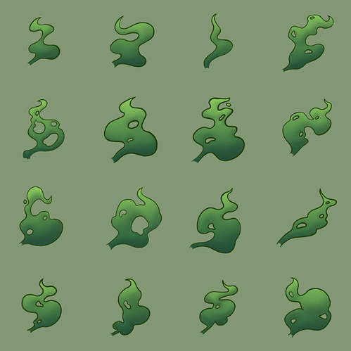
Some other cartoony smoke shapes exploration for practice:

I used some circular shapes as a guide for the final shapes:


1 Like

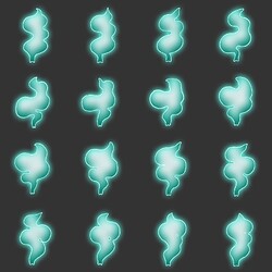
The previous smoke shapes looked like an animated spritesheet so I obviously went through the rabbithole of doing one, here are some results:
Untitled_Artwork_1
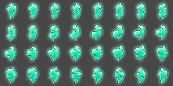
Ended up zoning out while making in-betweens and made a 32 frame animation :joy:
smoke_flipbook

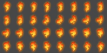
And using layer effects to quickly try a bit of shading and outline variations without having to redraw the 32 frames :woozy_face:


index

All in all it was a fun exercise :upside_down_face:

1 Like