Demon’s Souls - Soul Texture
My take:
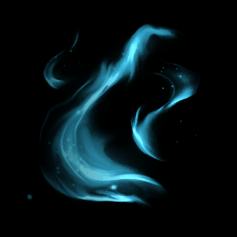
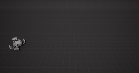
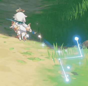
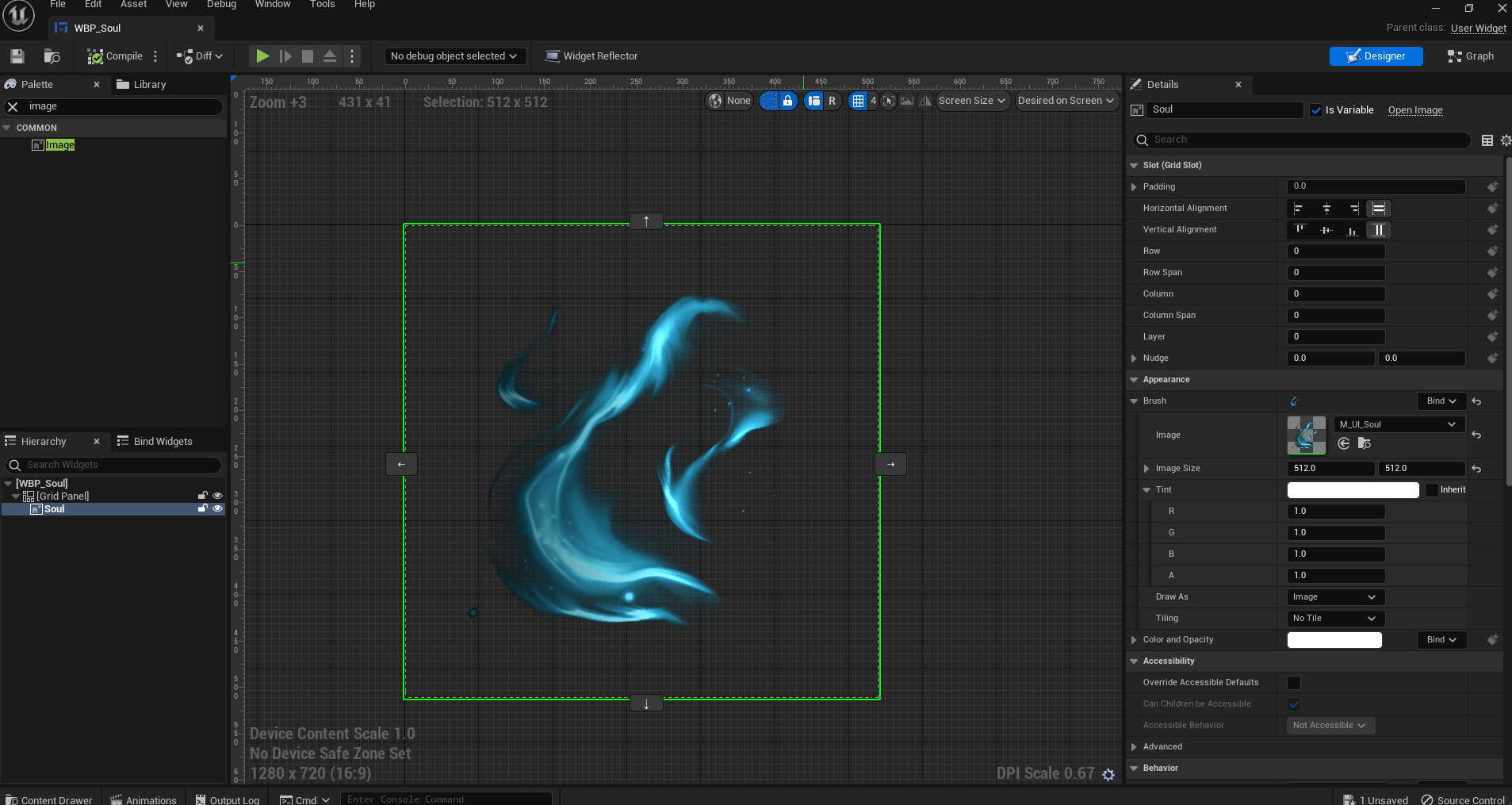
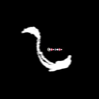
How it looks in the Game:
(sry for the trash recording from my phone  , just got my hands on a PS5 recently, not sure how to capture that with it)
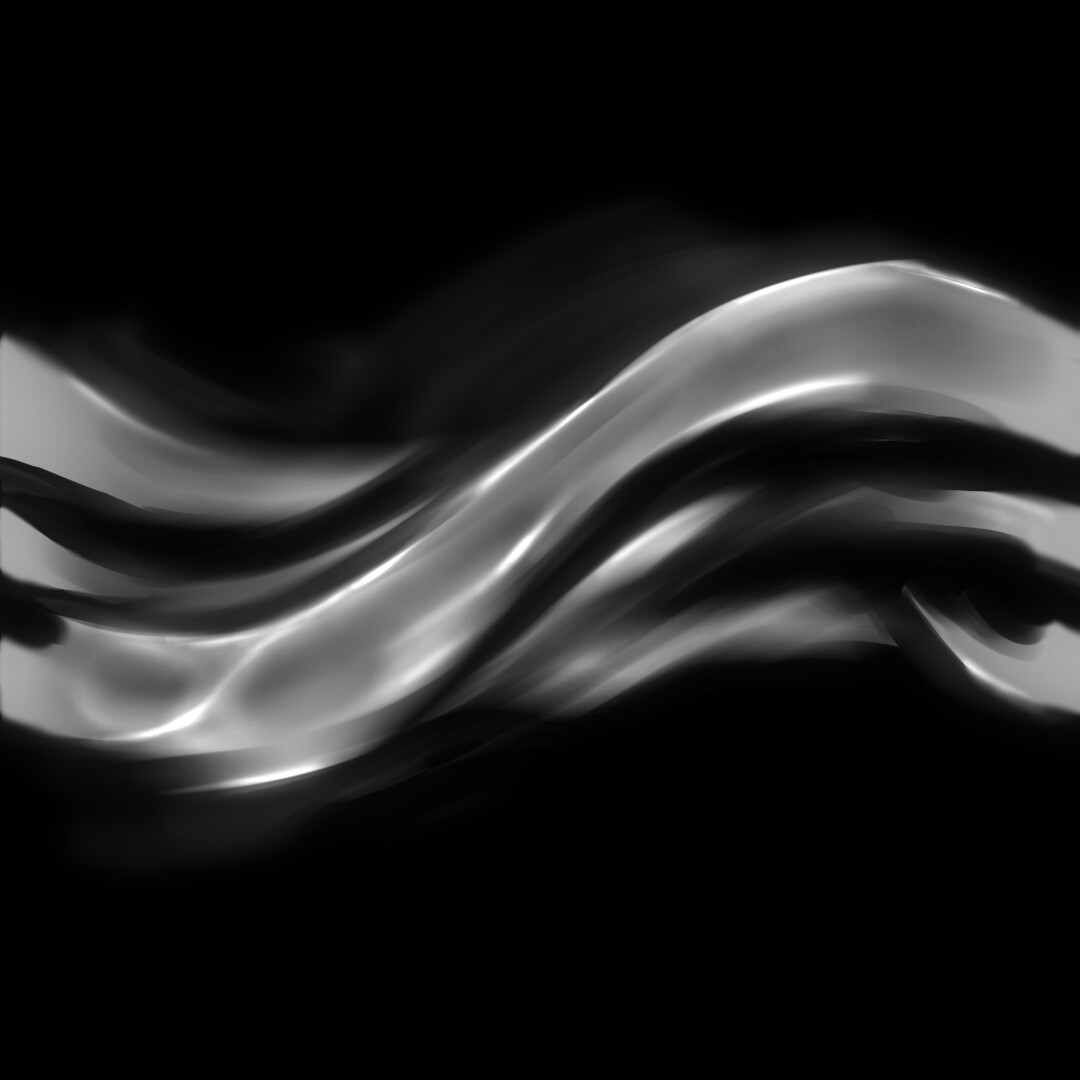
Aiming to improve upon my previous sketchbook thread, I’m back with a more complete overview of this mini tutorial on replicating the texture from Demon’s Souls Soul Icon. I’ll also post my UI Distortion Material I did for this UMG Widget.
So, a while ago, I stumbled upon Adam Rehmann’s Soul Icon post on ArtStation and I was eager to replicate it, so I brainstormed some ideas on achieving this effect.
Ideia 01: Procedural Smoke Trail Generator that Gavin Finley in Susbtance Design
Ideia 02: Flame Painter (Paid) This tool is awesome! The results it gives are super accurate compared to the reference
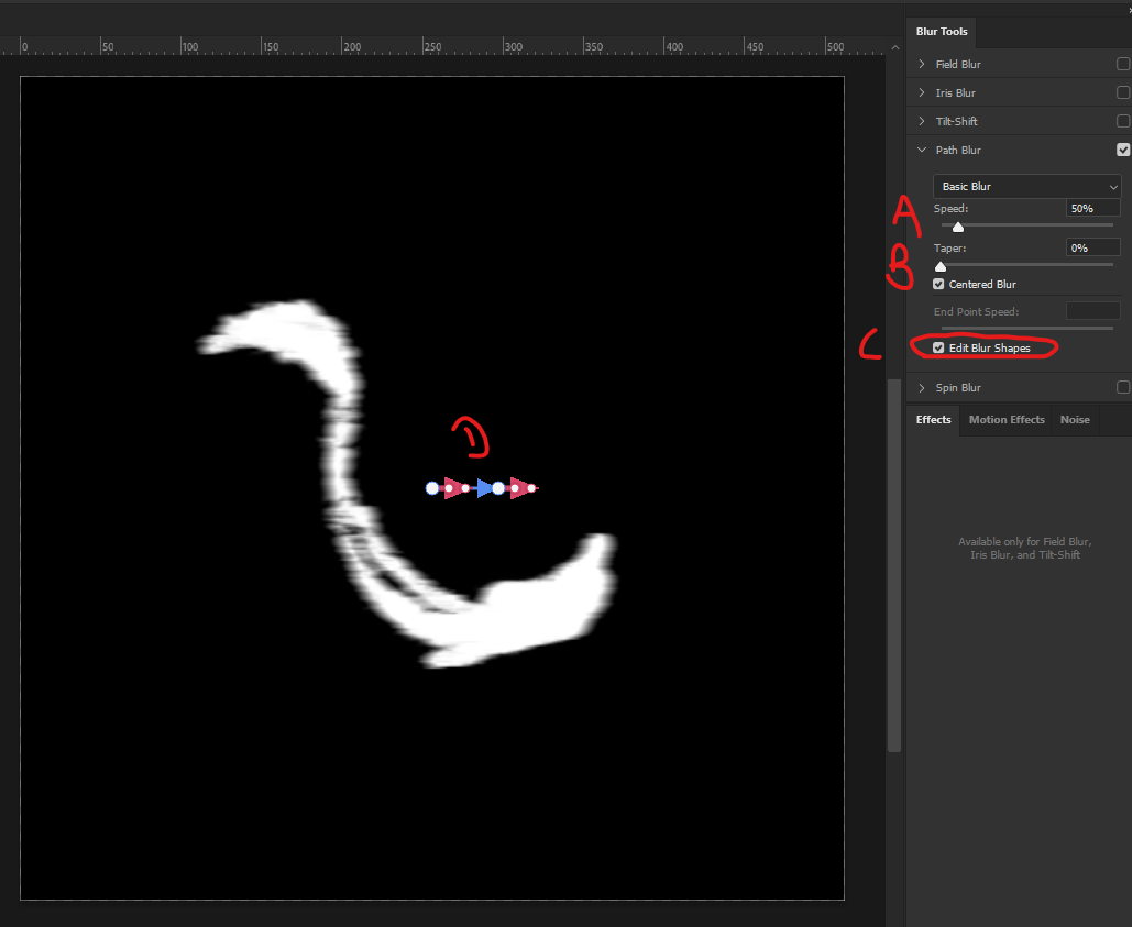
Ideia 03: Path Blur in Photoshop - Here are the steps I follow to achieve it.
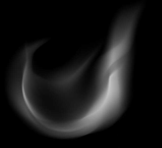
Step 01: Create a base shape with a Hard Brush or a Texture Brush
Both option are great, but each one gives a slightly different textures when the Path Blur is applied, so have fun with that! 
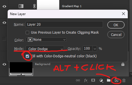
Step 02: Make it a smart object, so in case you need you can edit it later. Go to Filter > Blur Gallery > Path Blur
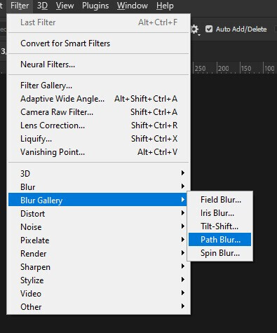
Step 03: A pop-up will appear. This is where the magic happens. The path blur tool consists of an arrow with points that you can add or remove. It shows the direction of the blur that will be applied to your drawing.
The 4 attributes you will work with:
- A: Speed
- B: Taper
- C: End Point Speed/Edit Blur Shapes
- D: Blur Arrow
First things first, make sure to check the “Edit Blur Shapes” option so that the red arrows appear on your screen. Then, you can have fun playing around with the arrow shape, adding multiple points to it. Experiment by adjusting the values for A, B, and C. Once you’re satisfied with the changes, simply hit “OK”.
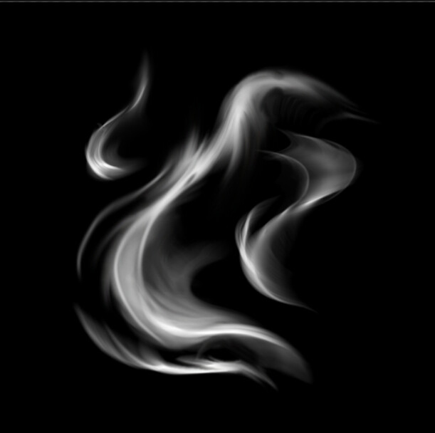
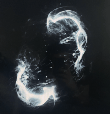
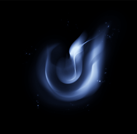
Step 04: Try using multiple shapes of different sizes. Adding small lines with a slight blur can add variation to the texture, enhancing its overall look. Additionally, using the smudge tool can help correct any unwanted artifacts created by the path blur or further customize your shapes. Spend a few minutes experimenting with these techniques, and you can achieve something like this
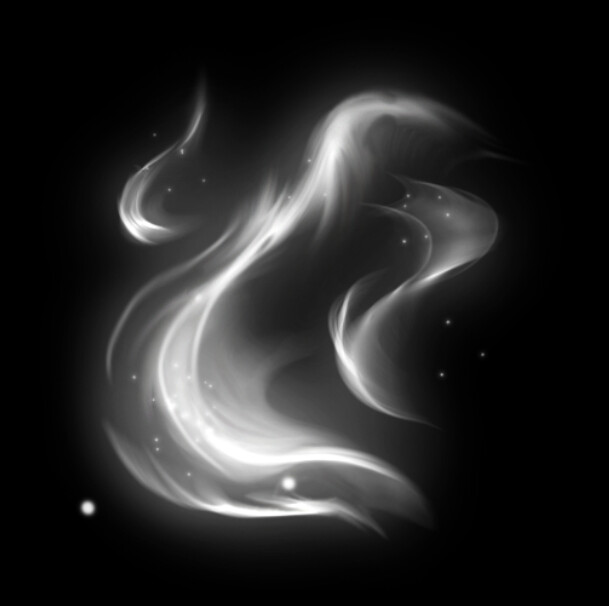
Step 05: Once you’re done with the composition, you have a couple of options to enhance it. You can duplicate it and apply a Gaussian blur, then send it behind your shapes for a soft glow effect. Alternatively, you can create a new layer and use a soft brush to paint the glow around your shapes. Don’t forget to add some small particles around for an extra touch.
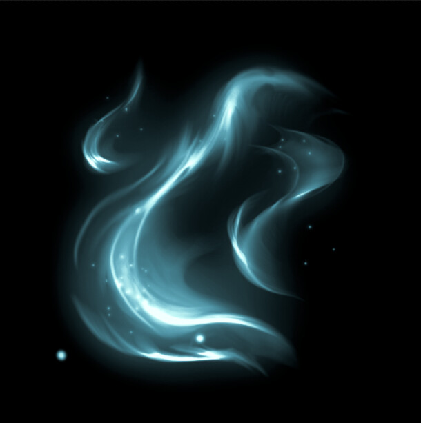
Step 06: Make a Gradient Map, and ta-daaah, it’s done! 
EXTRA TIP: I really love this trick in Photoshop, Here’s how it goes down: I slap a black layer on top of everything, switch the blend mode to Color Dodge, and grab a soft brush with super low opacity, like 5%-8% tops. Then, I just paint over the spots where I want to make things pop a bit more. It’s low-key, but it adds a nice touch to bring out those details.
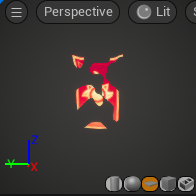
Before and After:
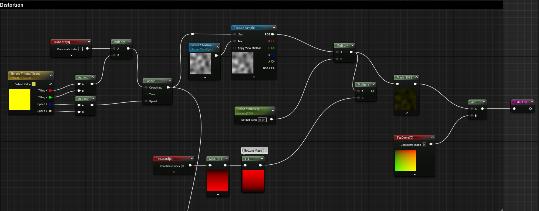
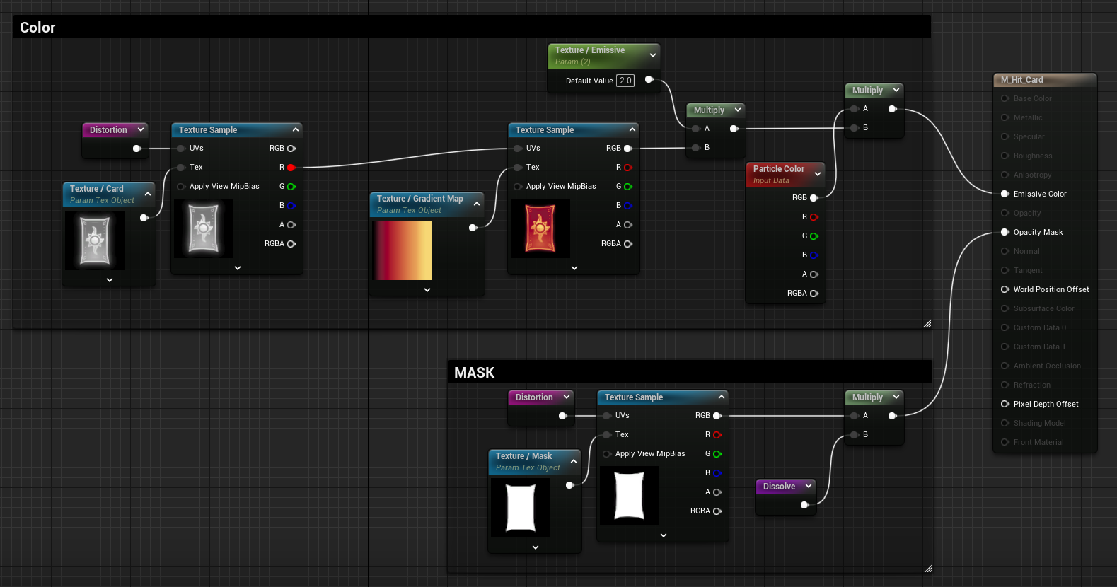
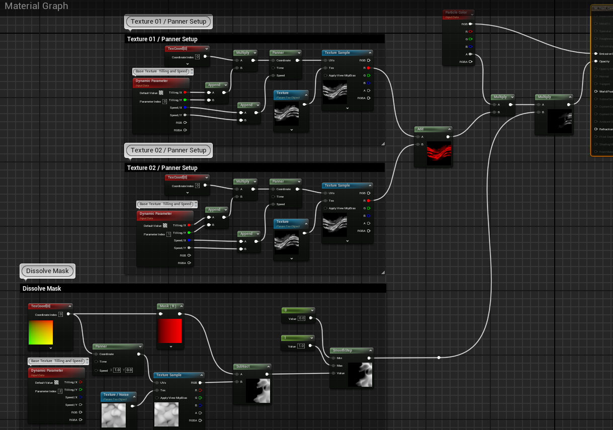
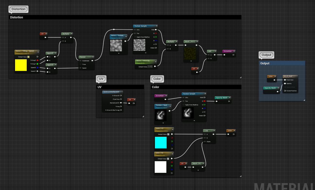
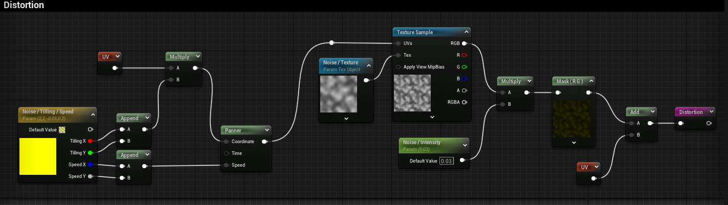
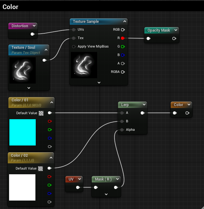
UI Material:
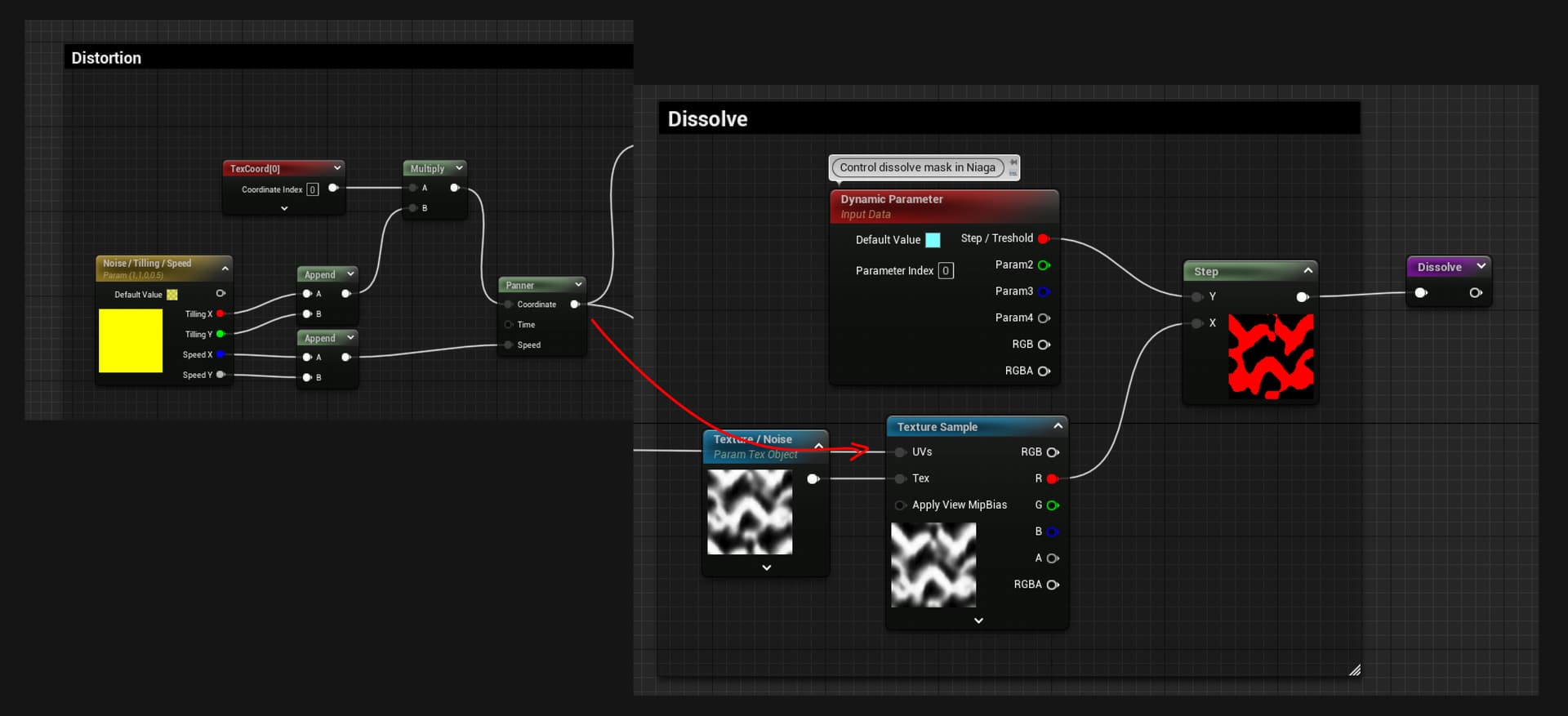
This one is pretty simple, is just a material UI Material with a texture with a distortion.
Distortion:
Color:
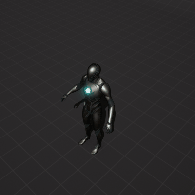
Widget: