Heyall, thought I’d introduce myself to the community by showing what I’m working on currently.
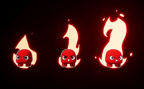
The context is a fighting game where after hitting someone you gain more power, and different characters express this power with different elements. The style is very simple so I made some 2d animations for the fire. I often become blind to my own work, so I really appreciate some feedback on how these feel to others!
On a side note, creating perfect gifs is hard…
Anyways, been lurking a bit and I’m really inspired by what you guys are doing and think vfx is superfun! Looking forward to talking with everyone:)
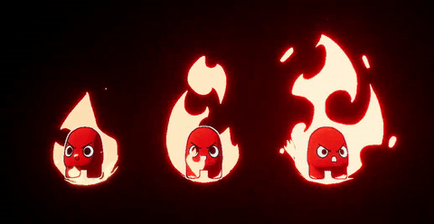
I’f I’d have to guess I think you made the left one first. In my oppinion, it lacks the animation, shape and definition which is so prominent in the others.
So I’d say try and redo the left one like you did the others. More variation, and take some of the styles of the others into account
If you need inspiration look at Jason Keysers tuts
Thanks, and yeah hehe, I did indeed create the left one first. It is kinda tame compared to the others, isn’t it? The goal was to create a progression of increased power, weak to strong from left to right, but if the left one doesn’t feel like it belongs in the series I must’ve done something wrong.
And i have watched a lot of Keyser, seems to me to be the only one who talks in depth about 2d effect animation… So kudos to him for doing that!
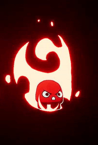
Thanks, and you’re right, they lack volume! Maybe a semi-sphere (like a basket) on the bottom? I haven’t had the chance to revisit and polish up this yet (working on another aura), but I really appreciate your feedback. It’s good that you pointed out that, I think it wouldn’t even take a lot to really help push it further. Like you said, only a little bit over the feet still do a lot!
I added some flames like you suggested and it looks a lot better!
Unfortunately, since the character is rendered in a custom depth pass, it doesn’t look very nice with that and the outline, dunno how to go about this yet.
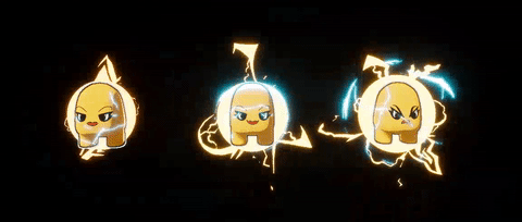
I’ve also come a long way on the electric aura! Tell me what you think!
looking sweet - do you have to have the solid circle in the electric ones? looks cool but would probably be a bit more dynamic with the edges broken up more.
I love how the first electric one looks like the sparks are walking around the circle.
Thanks! The first version didn’t include a solid shape in the middle, but it didn’t feel very connected to the character when moving around. In another version I tried being more dramatic with altering the circle’s shape, but honestly I found it got too noisy. It guess it doesn’t really make a whole lot of sense for it to be there, but I find its benefits two-fold:
1: it acts as a bridge between the sparks and the character and
2: it adds a nice glow which helps indicates both the characters location and power (the camera can get quite far away sometimes) Previously we added glow on the character itself but that messes with the colors, and since all the characters have the same basic silhouette, their color is their main signifier.
I too like the first one a lot, I followed the same principle of dancing sparks on the second and third, but since they were gonna be much more powerful it was hard to make it as clear:P
maybe if it just scales up and down slightly - or is slightly oval and rotates? dunno, i can see what works about it but it just looks a bit static in what should be quite a dynamic effect.