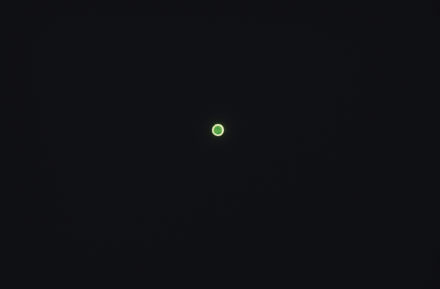
-Here is my Portal :
(low quality gif now)

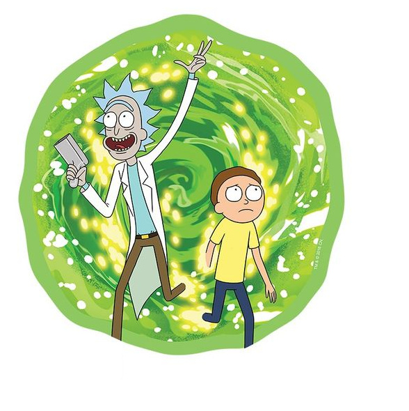
I’m creating a portal based on rick & morty one
(I hope i’m not out of theme ![]() )
)
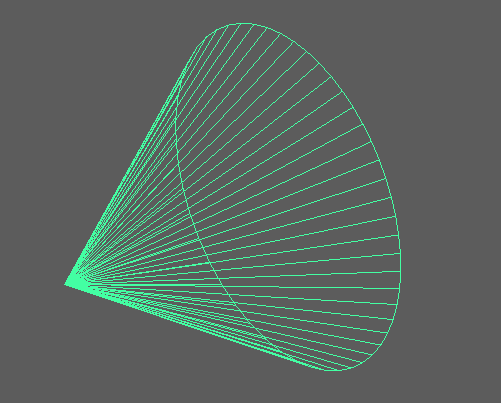
I first started with a simple mesh like that just in case I need some kind of depth
(a plane could have done the same job)
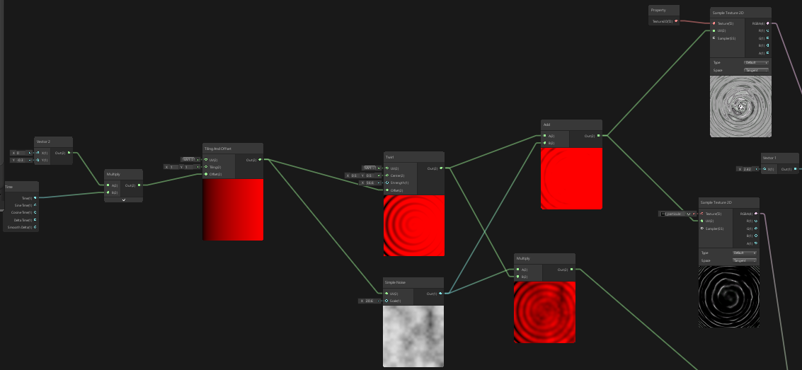
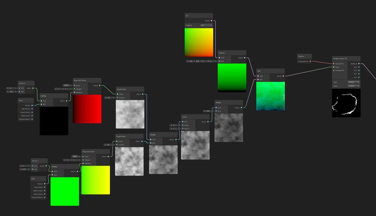
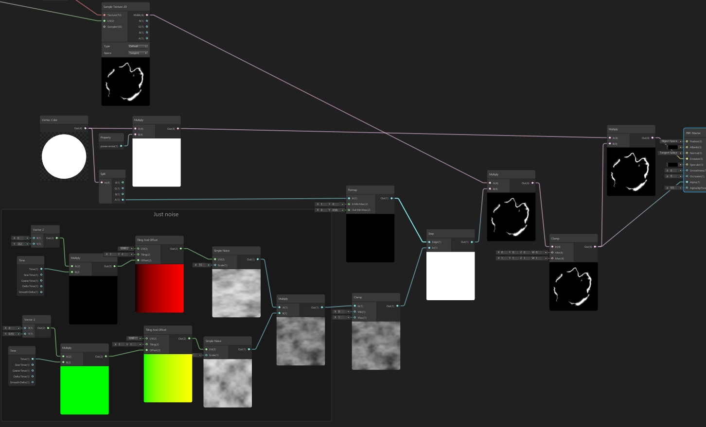
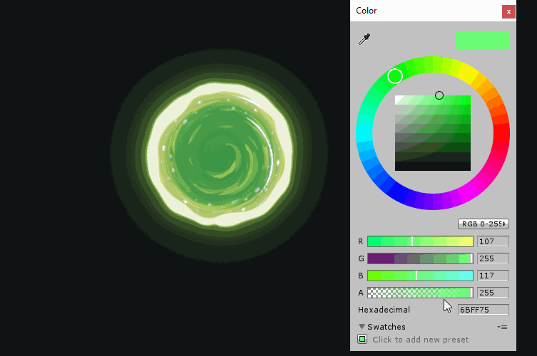
Most of the texture is done with a twirl and a simple noise
I choose to go for a some more “cutted” shapes because I think it’s fit better the style of the show.
To achieve this I’m using voronoi cells instead of my texture ![]()
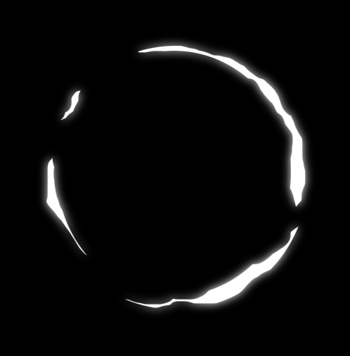
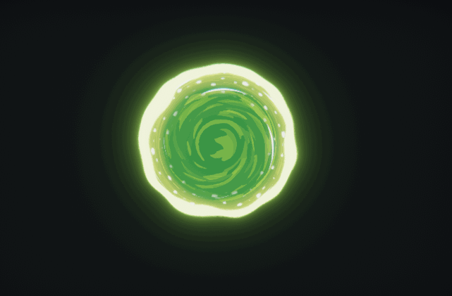
I also made a simple mask to have borders
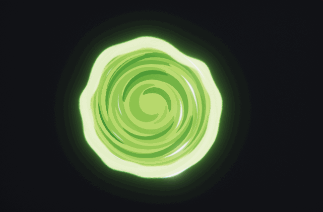
I worked on the border a little more to give a blobby aspect and added a little of yellow next to it
also I added the white dots (all of this is just textures & offset*time)
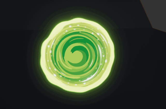
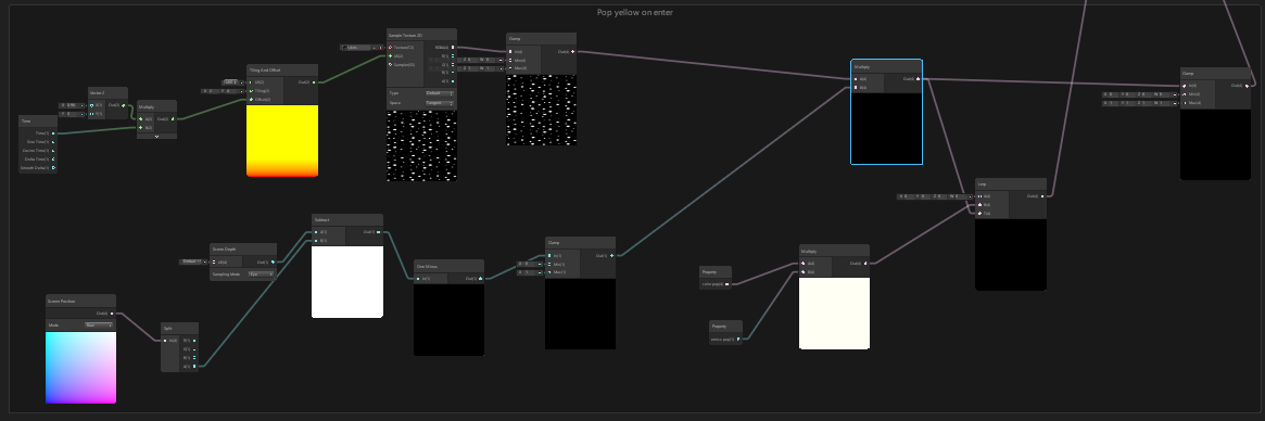
Next objectives were the yellow points you see when someone go trough the portal & more work on the spiral shapes
Here is how I make it kinda works:
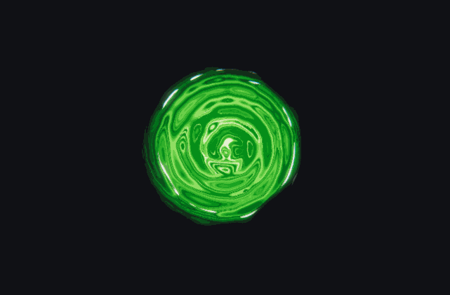
and here is how it looks
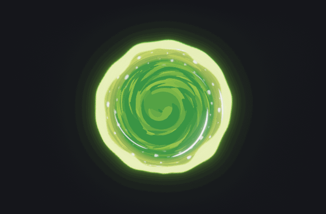
A little more use of depth fade and a simple oppening and closing with the particle system
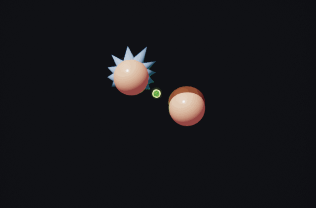
And a little work on the my characters ![]() + an animator to move them
+ an animator to move them
(they just come from behind the portal)

(quality is lower than ever because the gif is longer ![]() )
)
A little try on sparks with particles and trails
(not really what i wanted)
So I created a materials for sparks with moving UVs & Basic Disolve:
My texture (I changed it a little later but same principe)
Animating the texture with UV :
Simple disolve that i control with the alpha of my particle system:
And this are my sparks now:
Some little drops at the end
Then a little more work on the portal:
I can now control the speed of the effect with the alpha of my particle system
(vertex color node like for the disolve earlier)
So now I can add a little punch at the end of the effect ![]()
And we’re done ![]()
I am taking any of your feedbacks ![]()