Blood Moon Lux (League Fan-art)

Welp, I got a hold of the map and applied the textures to it. It’s certainly more readable now. Should I remove the structures and have a flat texture, or find the textures and add them? I don’t have the alpha’s so I don’t think that’d look very good. I think gray looks decent. The flat texture looks a bit distracting though (flat black surfaces).

I could try adding a fog plane that fades out in a circle. That might make it less distracting. Ideas?

2 Likes

Maybe this will help you: [for study only] Summoner rift 3d export - Download Free 3D model by Jenioss [ac0a9c6] - Sketchfab :slight_smile:

The fog might help make it less distracting indeed! I would like to implement a fog of war system in my own playground, but have no idea how. :’(

2 Likes

Yea that’s where I got it. Does the material auto-apply in Unity or something? I manually added the textures from the download. Unity doesn’t appear to use .mtl so it looks like I’m going to have to do it manually.

For my fog of war (not real-time), I’d probably use a horizontal plane with a soft mask. Or just edit it in post to save the guessing. I’m sure real-time requires code. I’m not the technical type :joy:

I don’t remember how I set that up, but I think it was kind of automatic, yes. :stuck_out_tongue:

Hmm, yea I had to use SF to apply the materials b/c Unity is being stupid. Also, there seems to be severe sorting issues with the meshes as well (you can see one of the torches on the right side is missing). It’ll reappear based on the camera angle. Idk what’s up with that but its annoying.

SF also appears to have a similar issue with sorting- instead of coloring the scene darker (with black) it’ll do some weird sorting thing because of how it’s layered. Anything below 3000 will become unlit desaturated blue. I had to set the spheres to a custom SF Shader, then set it to 3100 so it’s sorted above the plane (which is above all the meshes).

On another note- I realized that League’s environment is built around the camera. I had to readjust the angle to hide the open faces. I’m not that keen on the angle, so I’ve considered rotating the effect a certain degrees. That might help show more of the otherwise flat meshes.

3 Likes

Hey Folks,

I decided to create my own background instead of rip it. Too many issues and it’s probably best to just create it myself. It’s gonna take a while to paint it well. I’ll add geometry for the rocks once I get the main texture setup. Maybe even add some ambient wind particles for the scene. It’s kinda like an island strip or something.

It’s interesting to see how clear things become. I’ll have to reduce the opacity on stuff because it’s too opaque. There’s no longer a problem of legibility.

7 Likes

Hey Folks,

Thought I’d give a small update on the background. I’m still painting it but this is the direction I’m going. I had a “Sharktooth Ridge” in mind. A simple strip with jagged rocks that I can re-use for all my upcoming FX. I looked at the summoners rift for tone and values. I gotta add that lost-n’-found painterly stuff and blend some of the values down.

I’m thinking that I’d green-screen the FX then add them on top of the looping background in After Effects. That way stuff doesn’t pop every-time it changes.

P.S. I have no idea why there’s a huge gap between the posts. There’s no gap in the text editor.

8 Likes

Hey Folks,

I’m considering this done (or very very close :wink:). I added audio and updated the textures. There’s some minor issues with the mask, but it shouldn’t be that noticeable.

As for the next project- I’m thinking about doing a “Cosmic Dust” Twitch next. That or some kind of Warwick FX cuz’ ribbons n’ werewolves are cool! That blood scent is bad-ass and I love those glowy eyes.

Thanks for all the feedback everyone and I look forward to more inspiration! :smile:

https://www.youtube.com/watch?v=-hLIih4iEFU

7 Likes

First, let me say I’m a total scumbag for not getting back to you for such a long time. [insert a variety of excuses here as to why I didn’t prioritize giving you feedback earlier]

Okay, with that out of the way, I’ve got a few thoughts on these I wanted to float your way. I’ll base all of these notes off of your April 6 iteration. Let me know if any of these points need more clarification.

First, let me say I really enjoy a few aspects of these abilities: thematic cohesion, punchy timing, nicely crafted textures, and a good sense of color combos.

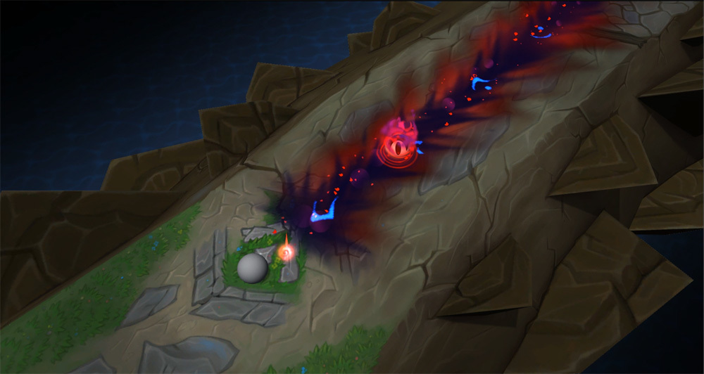
Second, the largest area for improvement across all these abilities is twofold: 1: clarity of gameplay with a well established hierarchy of focal point, and 2: dominating colors all competing against each other. So let’s get down to details on where I see room for improvement:


The auto attack hit impact feels pretty nice, but I think you could get it out of the gameplay space much more quickly. It currently obscures everything that happens beneath it and calls attention to itself for longer than is necessary. Once the indication of damage dealt is complete, the effect should also be complete, perhaps with the exception of small secondary elements lingering around for a bit (which you do nicely in a variety of your effects).

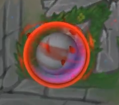
The cage is super opaque, and obscures the “character” beneath it completely, for most of its life. There’s a few levers you can pull to solve this, namely opacity and gaps in the shapes.

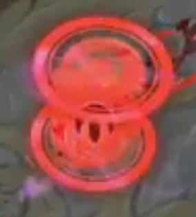
The shield is my favorite effect. It has a nice array of color depth, and clear priority to the outer rim element, with some nice subtle flavor in the middle.

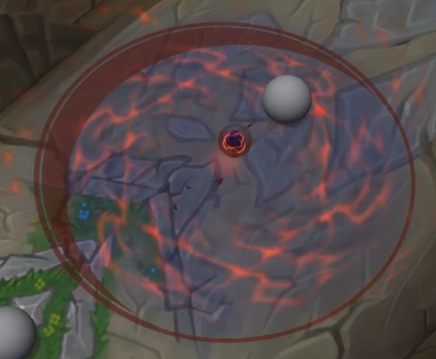
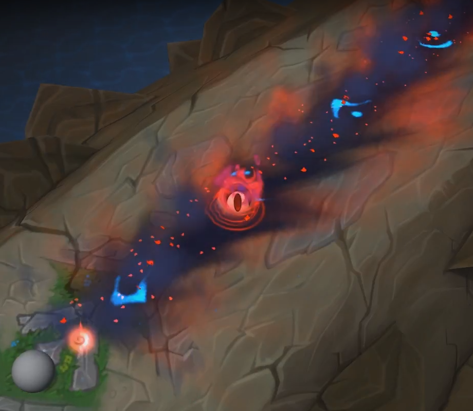
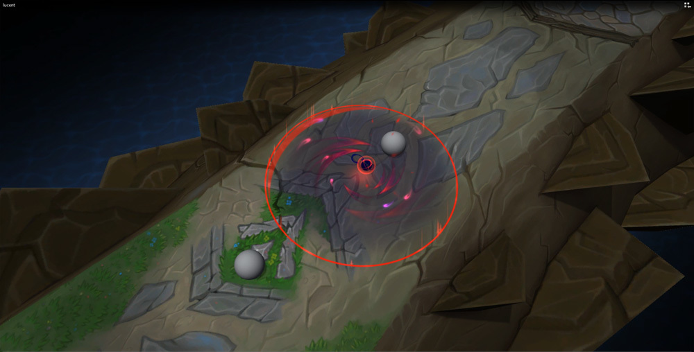
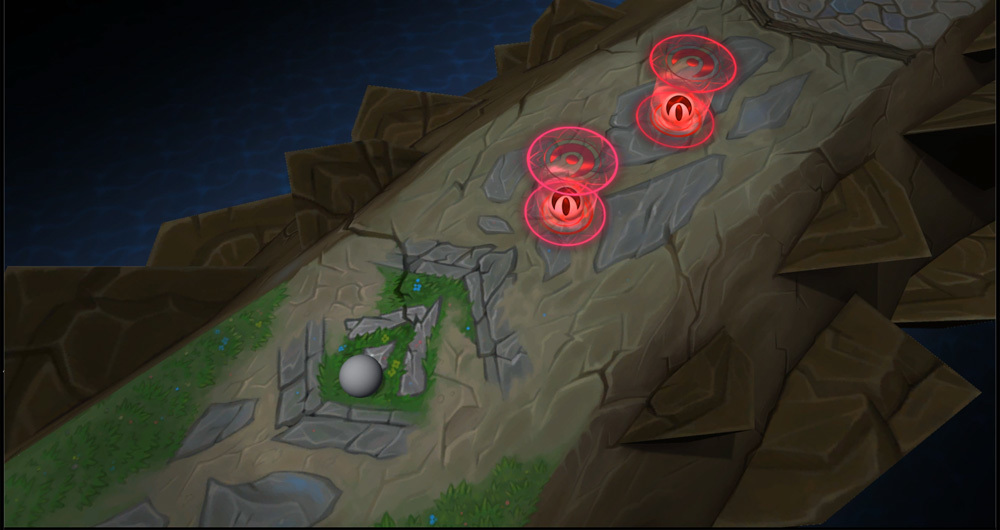
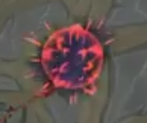
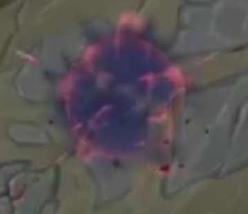
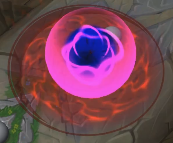
The elements in this AOE feels generally muddy. If you squint your eyes, the values and hues all start blending together. This can be solved by pushing the emphasis to the outer edge. Either more saturation, more value contrast, or some combination of the two. Similarly, you don’t need much in the center of the area. The elements you have are a bit too noisy, with lots of detail. A secondary element like that shouldn’t call too much attention to itself. Think “light wisps,” instead of “coursing energy.”

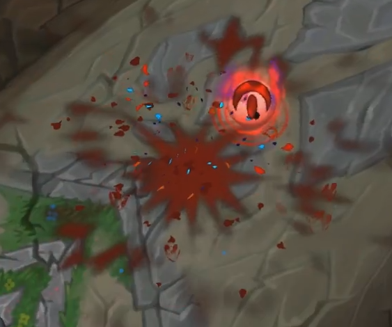
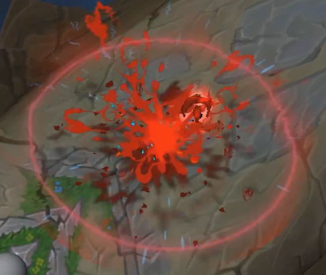
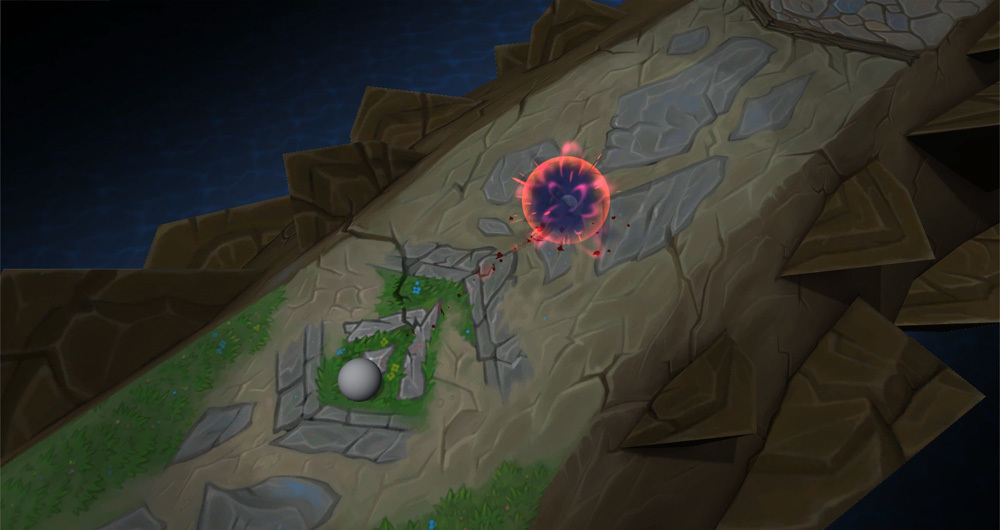
The explosion feels pretty satisfying. I like the massive dominant shape right before it explodes. Great contrast. That being said, the whole thing takes too long to resolve. You could get it out of the gameplay space much quicker so the action can continue along its merry way.

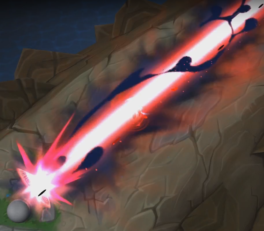
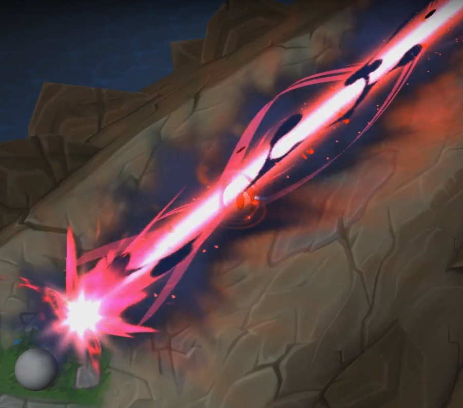
It’s nice to have contrast in the laser before it fires, but having the indicator disappear completely is harming the clarity of telegraphing what’s about to happen. You could have the motion accellerate toward the end of its life, or sharply change its color/value. But turning it off, even momentarily, hurts the clarity.

The punch is great during the effect, but the charred bits take too long to resolve. Also, you could paint in some crisp edges to go with the sutty smudges in that burnt ground texture. Some subtle variance in the opacity would help too.

Hope all that helps!

7 Likes

Hey Keyserito,

No problem! Thanks for taking the time man! The folks have been a great help as well and it’s been a fun process.

I’ll be sure to make the recommended changes! It’ll be some time though, I’ve gotten a bit busy recently.

1 Like

@Keyserito Hey, I finally got around to making improvements. I’ve included static images (since potato chip .gifs). What do you think? Thanks.

10 Likes

Nice! I really like these improvements :slight_smile: Cool idea with the blood moon sliding in and exploding when it’s filled.

2 Likes