Hello,
Riot Beardilocks here back with part 2 of my series on making successful missiles for League of Legends.
In Part 1 we discussed using the tools in our arsenal to make Areas of Focus to draw the player’s eye to the most important part of a spell. But how do we know what the most important part is? In this article we’re going to cover what information you’re trying to communicate with your visual effects.
What are we trying to communicate with our VFX?
When we’re making visual effects for games, it’s very rare that our only goal is to make some pretty eye candy that looks cool. Usually VFX represent an ability or action, whether it be flying bullets, a rocket explosion, or a magic spell. As such, we are usually trying to express some important information to the players about this spell or ability (as well as making it look cool). So what are we trying to communicate with a missile in League?:
What is this ability?
What does it do?
How much impact will it have?
Answering these questions will help you to design your visual effect to communicate this information most effectively to players. Let’s break these down further
What is this ability?
Probably the most important piece of information that you need to effectively communicate to players is which ability from your game this visual effect represents. For every unique ability in the game, you should associate some unique design language with that spell or effect, so that players can learn and recognise the ability at just a glance.
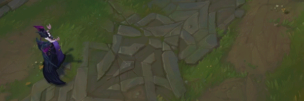
Here’s an example from League of Legends.
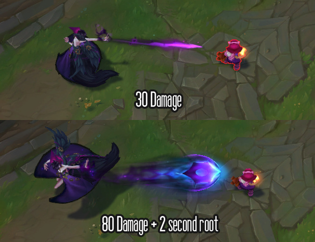
This character, Morgana, fires a missile that if it hits you it will root you to the ground for a few seconds.
In order to make this ability recognisable it has some specific design elements that differentiate it from all other missiles in League:
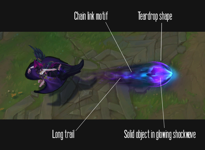
These elements together give the missile a unique appearance that only Morgana’s Dark Binding has.
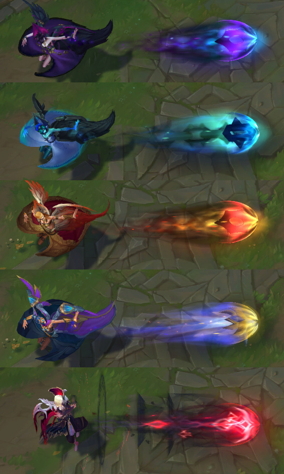
When we make skins nowadays we always change the appearance of the visual effects in addition to the character design. This can be challenging, as we need to maintain recongisability. This makes it particularly important to create a strong, unique visual identity for each spell when we create it, and adhere to that design language for each skin. This means we can change the colour or other aspects of the visual design and it should still be recognisable at a glance.
- Establishing a unique visual identity for each ability allows players to quickly associate it with a character and their gameplay
This is especially important in a game like League, as abilities often have multiple effects or unique interactions. But it’s also true for other games like shooters, though the unique cue might be a unique smoke trail behind a bullet or specific shaped muzzle flashes from a gun.
What does it do?
Even with a unique design for each effect, players still need to play the game or read the ability text to figure out what each spell does. LoL is a game with almost 150 characters, each with 5 (or more) abilities, so there are more than 750 unique abilities, all with unique VFX! This is a lot to learn and remember!
As visual designers we want to help players learn what an ability does as soon as possible when playing, preferably without having to go research between games.
As such, we want to establish and use a set of shared visual design when abilities have similar effects to each other.
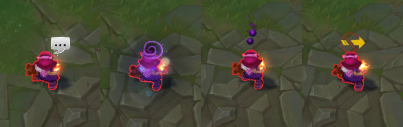
Let’s take a look at Morgana’s Dark Binding spell as an example. When it hits the target, it will root them to the ground for a few seconds, preventing them from moving.
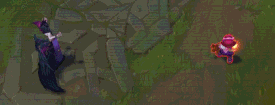
Note that the target hit by Morgana’s target has a ring on the floor around her, and a cylinder coming up from it that looks like it would prevent her from moving. This is the visual design language we have established in League for roots like this. When developing new visual effects or skins, if an ability roots, we try to make it look similar to this. Here are some examples:

There are plenty of other rules we apply to communicate the effect of our spell visuals. Including, but not limited to:
Heals should be green, and their shape should not feel threatening
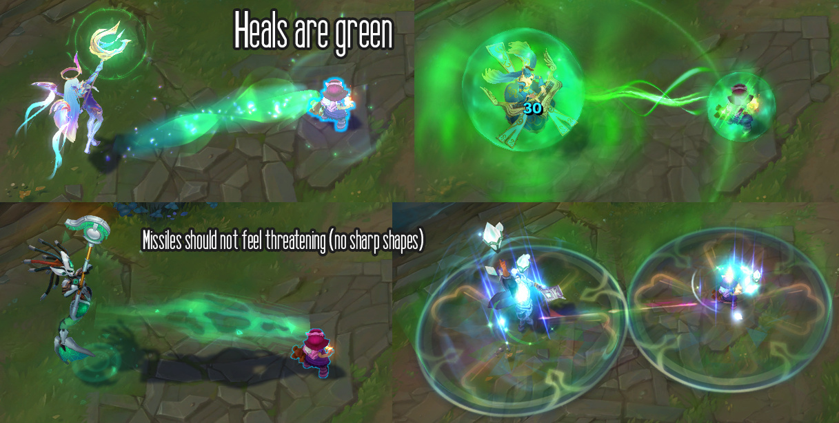
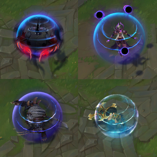
Spell shields have pulsing lines panning down them
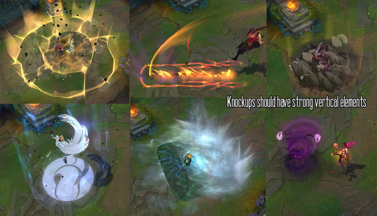
Abilities that knock targets up into the air (“Knockups”) have strong vertical elementss
- Maintaining consistent visual design for abilities with similar effects will help players to learn them more quickly, and understand the mechanics of your game more easily
Another part of this is using existing tropes from video games to communicate status effects, such as poison, silence or stun. Where possible we should use intuitively understood visual designs, rather than trying to reinvent the wheel on every effect.
How much impact will it have?
Does your spell do tons of damage? Or are your attacks going be like slapping with a pool noodle?
There’s always a temptation as a VFX artist to make absolutely everything you create be the most stunning, satisfying visual spectacle imaginable.
However, it’s important to communicate how strong an ability is using the visual design tools available to you. Just as I mentioned in Part 1, if everything is important, nothing is important.
As such, spells that do more damage should be bigger, brighter, and more threatening, with sharper shapes and more attention-grabbing timing.
However, there are more factors to consider than just damage alone. For example, if a spell is going to cause a stun, root or other status effect, it should have a more impactful visual than an ability that does damage alone, as a root would result in a player being vulnerable to follow up attacks from other enemies. Other considerations would be if the spell is something you can dodge, or if it’s an ability likely to be thrown out while the caster is concealed out of sight.
A useful exercise we do on League for new champions is to ask the designers to provide us with a Visual Hierarchy document, where they rate a spell’s importance from 1-10. This helps us to make sure the visual importance matches the gameplay importance when we make our VFX. Here’s an example of what the visual hierarchy for Morgana might look like, along with the reference key:
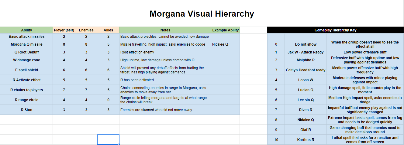
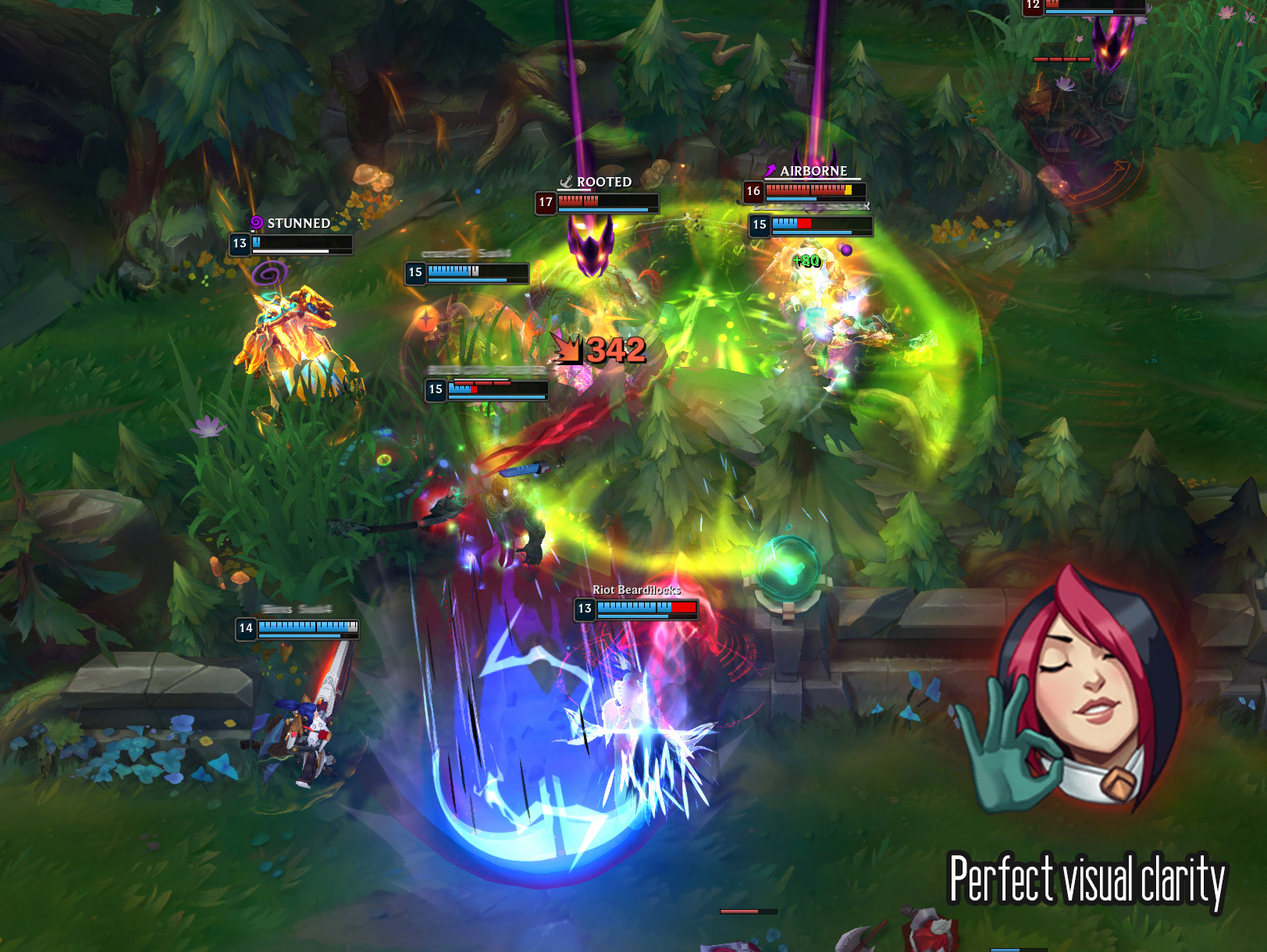
This gives us a rough guide of how visually important to make a spell. By adhering to these guidelines we can make sure that the most important spells and abilities within our game will really stand out, even during busy teamfights, where there can be a lot of VFX happening at once.
You can see in the document that we also rate the visual importance not just for the player, but for their enemies and their allies; if these values differ significantly we might consider making a visual effect that looks different from different perspectives. There is only one ability for Morgana where the importance differs enough to warrant creating a different effect for different views - her R range circle:
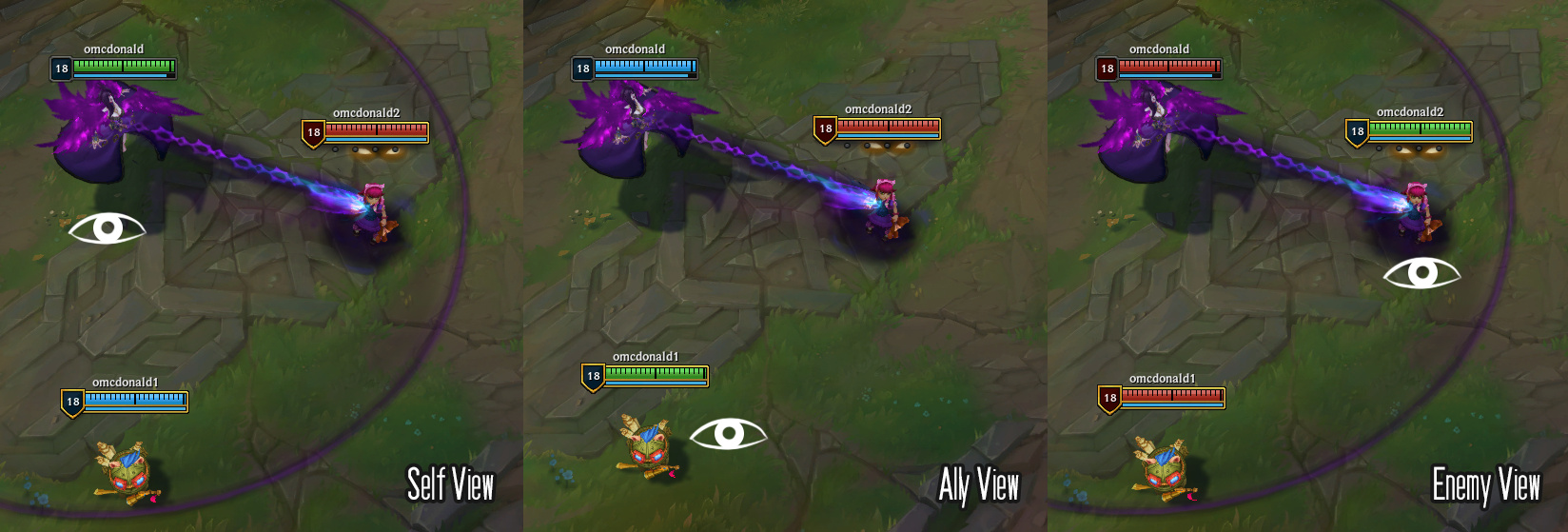
In this case this is an important piece of information for Morgana and affected targets to play around - her enemies need to get out of the circle to avoid being stunned by her chains, Morgana must try to make sure they do not escape. However, this is not important to her allies, as the circle does not provide any information that would affect their play. Since it will only add visual clutter to allies, the circle is only shown to Morgana and targets affected by the chains. This helps us to minimise visual clutter in team fights.
- Understanding the gameplay impact of the abilities in your game allows you to create a clear visual hierarchy with your VFX, to communicate the importance of your spell and minimise unnecessary clutter
So there you have some questions you can ask when you set out to make an effect, that will help you to guide your creative decisions when designing your visuals.