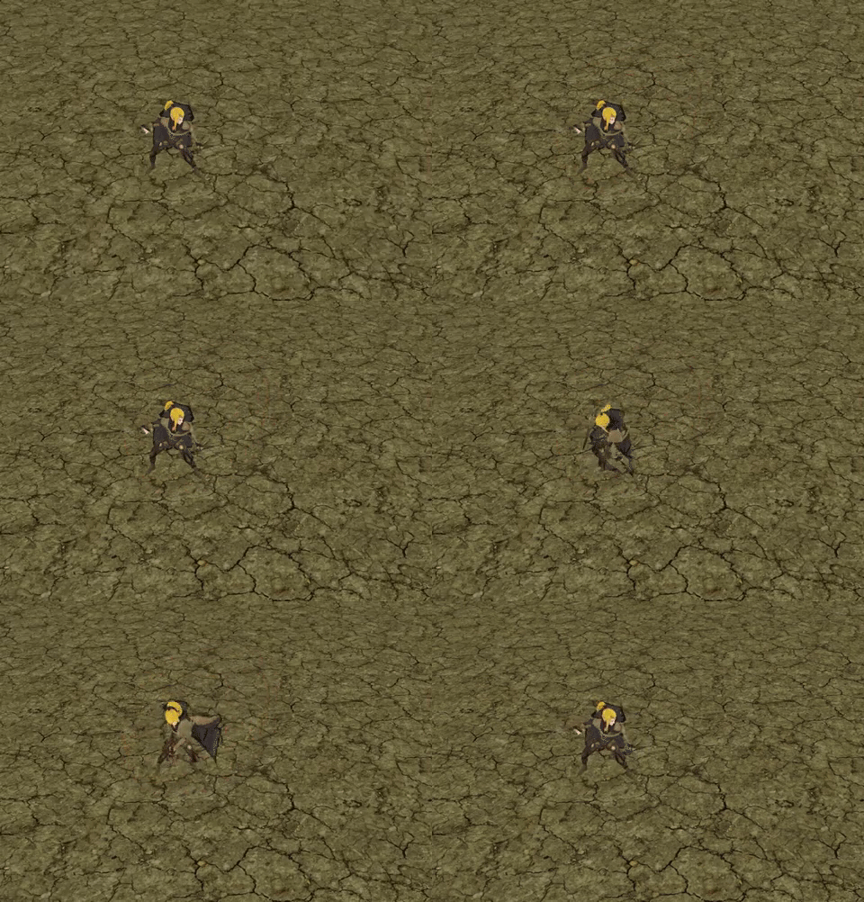
WIP - Sword Slash Attack :)

Watching videos on Unity about FX, learning and trying to create all kinds of effects. Here’s the sword slash. C&C on how I can make this better will be very much appreciated. :slight_smile:

Effects individually for better viewing:

Slash trail only (Orange “fire slash” fades out at end, fade in fade out hints of whites at the middle for “wind”, fade in fade out hint of black following the trail for “smoke” because firey orange, darkred/maroon for a “bleedy” slash effect, holy distortion shader for distorted “heatwave” effect.)

Impact only: ( purple signifying slash hit, red flash, blood red, orange sparks from impact, blood red sparks/drops flying away)
3 Likes

The width of the slash effect feels a bit too thick; maybe cut it down by 1/3. You have some nice colors in it, but it almost feels like there are too many. I see maroon, orange, white and purple. It’s good to have some contrasting colors, but keep your range narrow, or disperse your contrasting colors towards the center of the slash, like the top center orange/black one in this image

5 Likes

Thanks for your feedback Travis. I will definitely work on the slash a bit more perhaps thinner. Great eye on spotting the colors! :smiley: I’ll post the slash and impact separately so you can see the colors better and give me better feedback.

Slash trail only (Orange “fire slash” fades out at end, fade in fade out hints of whites at the middle for “wind”, fade in fade out hint of black following the trail for “smoke” because firey orange, darkred/maroon for a “bleedy” slash effect, holy distortion shader for distorted “heatwave” effect.)

Impact only: ( purple signifying slash hit, red flash, blood red, orange sparks from impact, blood red sparks/drops flying away)

Cheers. :upside_down:

2 Likes

I did forget to mention that the shape of your slash effect is really nice. I enjoy the jagged edges and it follows the sword’s path in the animation really well. The maroon gives a good contrast to the hotter white values and shows off the noise and jagged edge of the slash well, but I think it’s the wrong color for that. I’d recommend trying out something more orangy for that front part to compliment the rest of the colors in the slash. You can keep the maroon, but I’d just recommend moving it to a different part of the effect, maybe closer to your impact.

3 Likes

You could have the impact effect be more directional, right now the trail has a very clear direction, but the impact just starts at a joint and doesn’t seem to really match up with the slash.

Some type of secondary faint trail aftermath would be nice as well. As it is the trail dies off a little suddenly.

1 Like

Ah that makes a lot of sense. Thank you for your feedback Cubik. :smile:

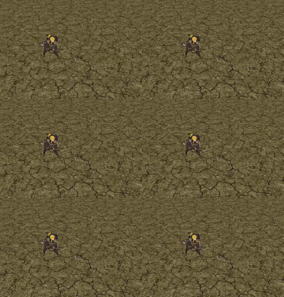
My thought process behind the static impact was because I assumed there to be an imaginary player / enemy and whenever the slash trail collides with player body it plays the impact and blood.
How would you suggest making an impact follow directionality? A tangential trajectory like in the image perhaps? Vr being the way a blood/impact should be?

Also right now I have the trail fading out towards the end. How do you mean about a secondary trail aftermath? Like another trail that follows the arc? Maybe some black smokey poof towards the end?

1 Like

Yeah, that makes sense and is that’s what I thought you were going for. My suggestion was mainly about the fact that the impact doesn’t support the slash movement and looks more like a bullet/point impact effect. Which is fine, but you might want to do what you suggest with your image and make everything in the blood effect inherit a percentage of the speed and direction of the slash.

Another trail or a secondary, slower traveling layer in your main slash material that has a darker and inverted color would be what I’m talking about. Right now everything moves and fades at the same time, so another layer would add some more complexity to the effect.

A flat ground decal with the same cresent shape as the main slash that you can rotate at the same time as the slash and fade over time would be cool. Maybe use the same coloration as the main slash but make it fainter and change it over time to more a brownish color to at the end blend in with- and disappear in the ground.

1 Like