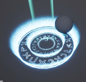
First of all, I think the effect looks cool. Even without context, I can guess what it is doing just from visual style and movement.
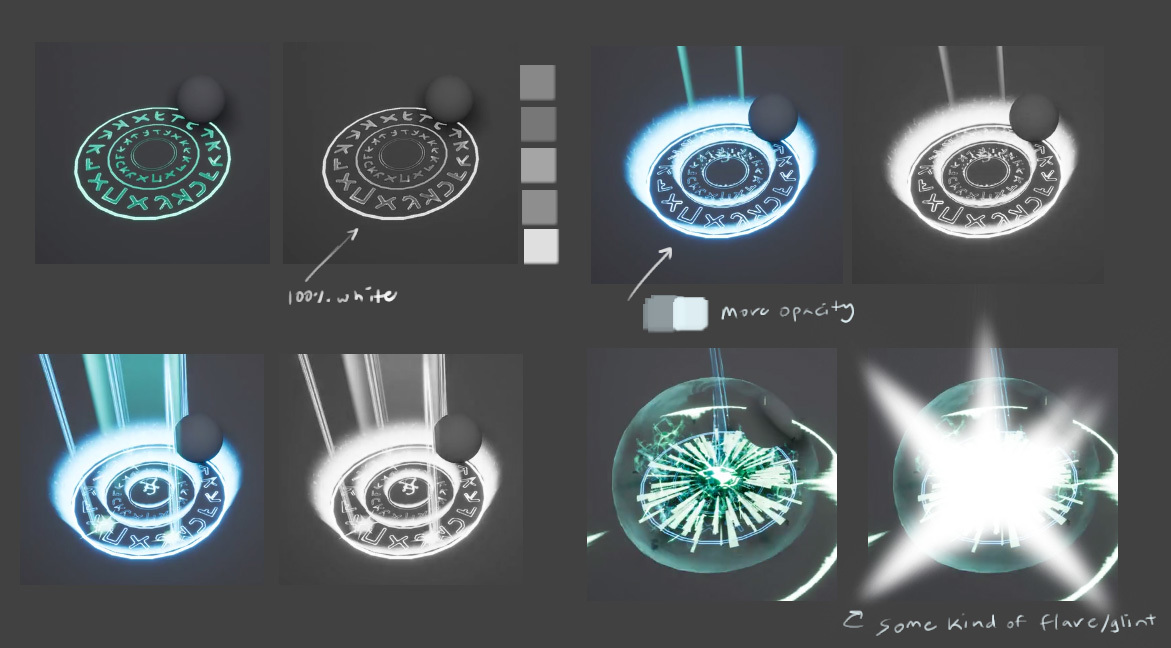
I think what you are seeing here, (and why it looks somewhat weird) is mixing of style.
Your effect starts of really graphic, sharp edges, readable froms.
Then it gets harder to read because of color overlap and a lot happening at the same time, and it gets more blury
And in the end the effect becomes somewhat organic.
Any of these stages work perfectly well on their own, but they feel uncanny together.
The player should be able to read what is happening in these kind of effects, so its often better to stick to one style, one meaning. (Unless ofcource it is meant as an effect which signifies either one of two meanings, like an effect which changes style of environment for example, or something which is meant as being out of place. Think the last Saint Row game)
I’d say, what you could try to improve
to make less colors overlap at the same time (From what I can see, the biggest culprits are the green beams overlapping your blue letters).
Choose a general style (Graphic or Organic in movement) - (Stylized or Realistic - General Visual style).
You can also chose a more specific style (Think league of legend theme skins)
Then finaly, try to implement animation principles
http://www.howdesign.com/web-design-resources-technology/12-basic-principles-animation-motion-design/
Biggest problem I see in the effect at the moment however, is the sudden dissapearing of the expanding ring. It feels really weird because the rest of the movement is organic, and then suddenly its gone.
I hope this is kind of what you where looking for, I’m still learning a lot of these things myself.
And I’m sorry for the wall of text. I’ll look into adding some visual ref, and links when I find time, this evening 
Keep up the good work