I really love your overall motion and timing of elements, it’s super fluid and fun to look at! The shapes you are making are also very cool. That first ability with the rocks is really well done. I love that hit effect.
I’m going to be a bit picky here with the feedback! I’m also taking on the assumption that you’re shooting for MOBA style effects. One thing that I think could be clarified on a couple of abilities is the focal point and where you direct the eye of the player. Usually we try to put focus on the parts of an ability that are relevant to gameplay, and keep and “nice” looking pieces as secondary or tertiary. An example of this is with the glowing rock and the missile in your first ability:
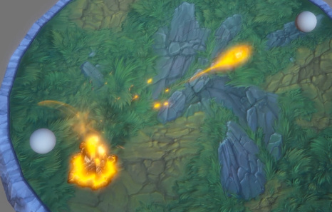
Both the rock and missile and rock draw my eye. I’m assuming the missile is the most gameplay relevant piece in this ability, so perhaps toning down the rock once the missile has left can help the audience look at the missile.
The other major offender of this to me is in your Call of The Void ability:
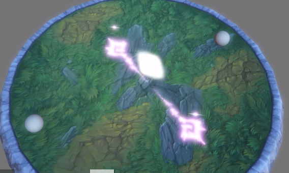
My eye doesn’t really know where to look for gameplay relevant pieces. The ground decal and the orbs that move towards the center share an equal amount of my focus, and because of that I’m not sure what to look at in this ability (overall I really love the aesthetic, it’s just focus point, allowing some elements to be secondary, and tertiary, sintead of everything being primary focus).
Value, hue, saturation, shape, motion and contrast with all of those things is how you can usually effect your focal points. Moving away from your specific works, I’m gona speak bit hypothetically here  . Sharp shapes on their own don’t draw a players eye, but when sharp shapes are right next to soft shapes, that is contrast and my eye is drawn to it. Value is the same. My eye isn’t drawn to bright effects if everything is bright, but will be drawn if darker values are right next to it (keep in mind the ground of the game your making the effect for, because that is often a piece in the equation). Saturation is the same. Put low saturation right next to high saturation and it will draw your eye. I think you have great control over a majority of this, but I went ahead and made this little chart to hopefully help others who come across this post:
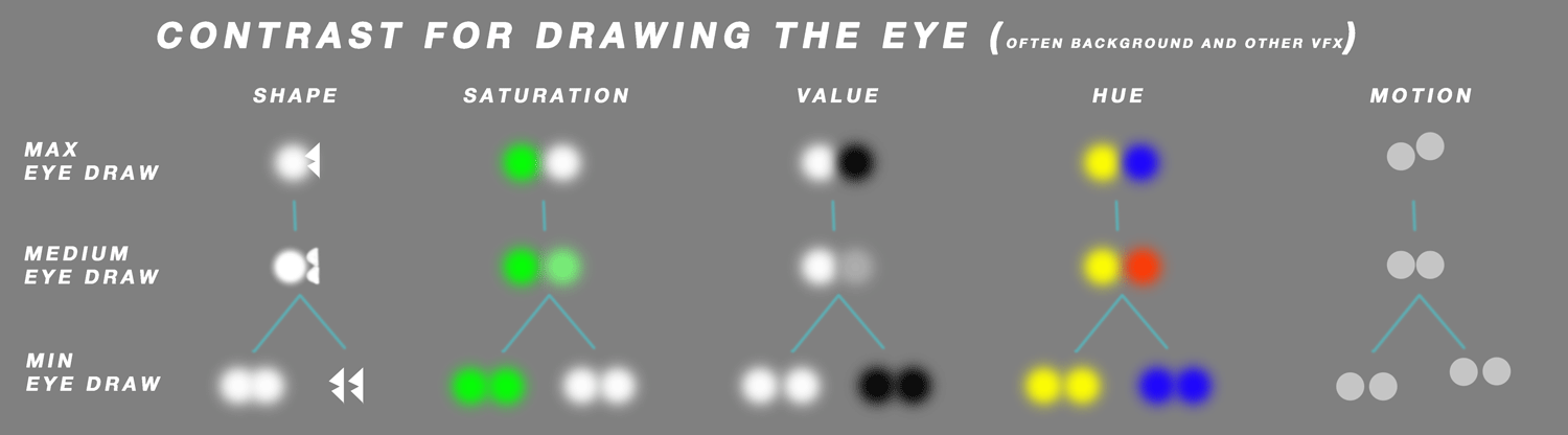
These are all in relation to the background the effect is on, as well as surrounding VFX.
Looking forward to more from you Dragonthyme! Overall this is really fantastic work that is 90% there, now for that last 10% polish work!