I’ve started working on a new VFX Fan-Art for League (heavily W.I.P). I’m pretty sure I could see a PROJECT: Annie as a future skin. I’ve been wanting to do something that incorporates Kassadin’s void trails (makes me think of digital magic). Also this came to mind when creating my effect (digital fire).
For some reason, I imagine her using a similar color scheme as PROJECT: Yi. Tibber’s would be primarily white with some orange accents on him. He’d look sorta like a futuristic straight-jacket. Annie would have a mask similar to PROJECT: Zed. Just my thoughts haha.
I like Katarina’s color scheme so I wanted to use that as the “passive” indicator, then have the brighter color denote it’s active effect (stun). I was considering adding a vertical element/glint that last’s while the target is stunned (Similar to katarina’s dagger aura). I chose dark purple for the indicator backing because it a warmer tone.
The glint might be unnecessary since it’s not an impact. The fire just sorta combs over the target. I just wanted to try something interesting
I’m still thinking of a design for the spell indicator. The indicator’s gonna be traced by the spire trails as it spawns.
I really love the stun passive idea! Only thing I could say about it would be that her passive indicator is too visible. In-game, it’s a very subtle white swirl that turns around her. Here, it might be a bit too obvious. It’s also good to differentiate her passive indicator from the “stunned” indicator a bit more, though I wouldn’t worry too much about it.
For the AOE, I could really see a “wave” filling the shape a bit, as to make it a tad more visible.
Of course, not as bright as this, and not as plain, but you get the idea.
The particles are nice !
For her colors, I could see something a bit fierier, with less pinks and hotter orange. Maybe something more along this line?
Maybe adding some darker elements could fit since she is the Dark Child. I could actually see her using a dark purple scheme for it, like her goth skin.
I cannot wait to see what you’re gonna do next. Her shield, her Q… And Mecha Tibbers? :’)
I pushed the color more towards red (from purple) since it is fire. I’ll adjust that though, I just wanted to see how it’d look. It definitely looks girly/cutesy. Although, If I’m going for a more aggressive design, I’ll use a more serious color palette.
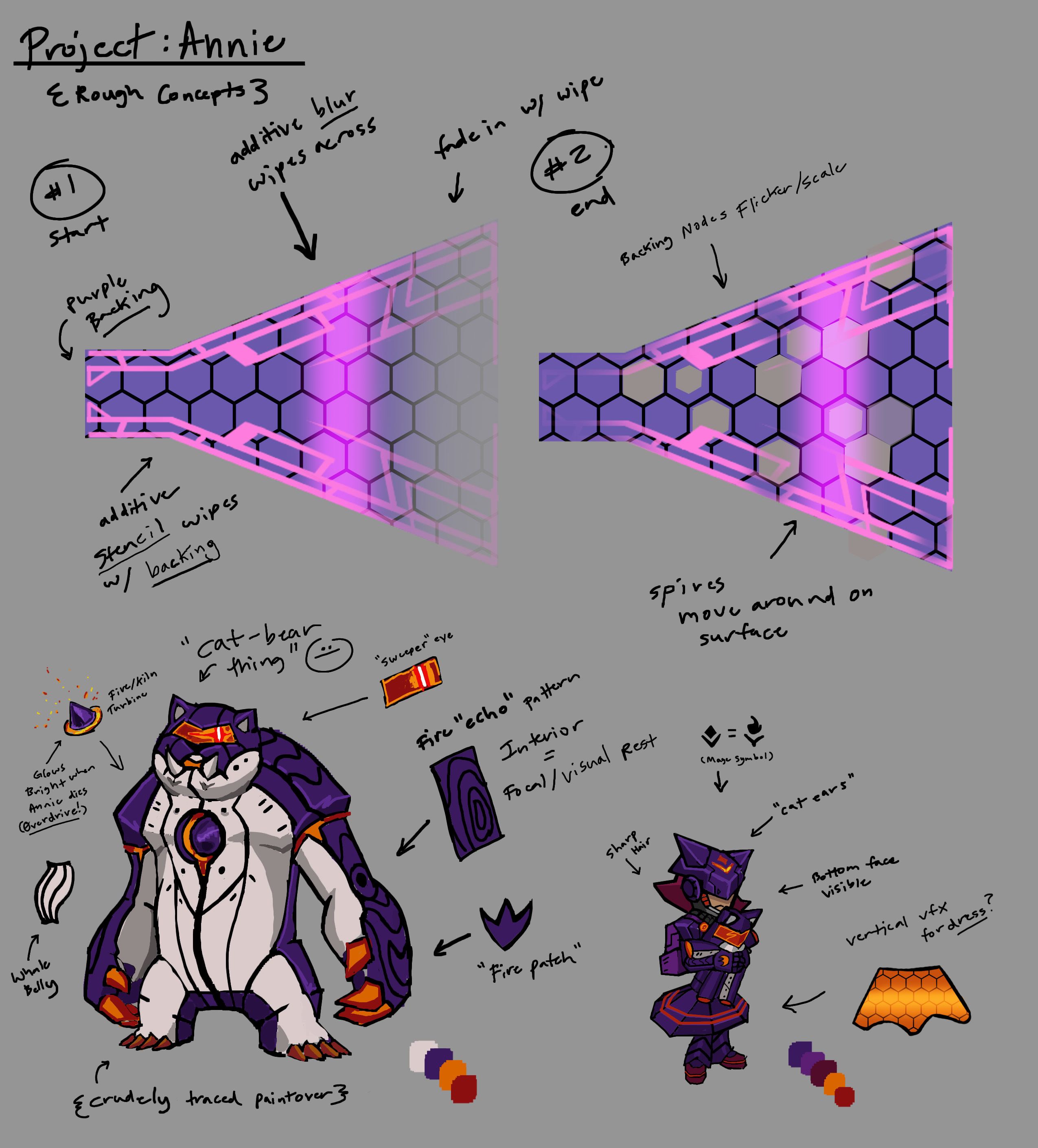
I did an (extremely) crude paint-over of what I had in mind for their skin design. It’s still working out the design and color weight (dominant color/accents/etc). I thought it’d be interesting if a fiery turbine was in Tibber’s chest and accelerated/glowed when she died (ultimate attack passive). The texture would be some kind of synthetic plastic/cloth with nodes/slats on it. For some reason, I think of penguins when I look at this color scheme. I’m not sure if that’s a good or bad thing haha.
For Annie, I was thinking she’d have some kind of hexagonal skirt with a sweeping effect. It’d help break up the design more. Alternatively, it can just be a regular sheet like it is now with subtle reddish accents. If I make the models, I’m only going to make tibbers (for the ultimate). It’s gonna take alot more iterations before I commit for reals.
Here’s the latest on my Project: ANNIE Fan-Art. I just dropped the VFX into my scene for context.
I’m trying to keep things relatively simple since its futuristic. I get tempted to make a complex spell indicator haha. It becomes super distracting though.
The spell indicator both wipes and fills up (as well as blips with hexagons).
I considered making the hexagons move, but that’d be too much motion, especially since the spires are flying around.
I want the color range to be between purple and red for the design (fire/darkness).
I kept the stun passive basic. It’s just a spinning “loading” icon.
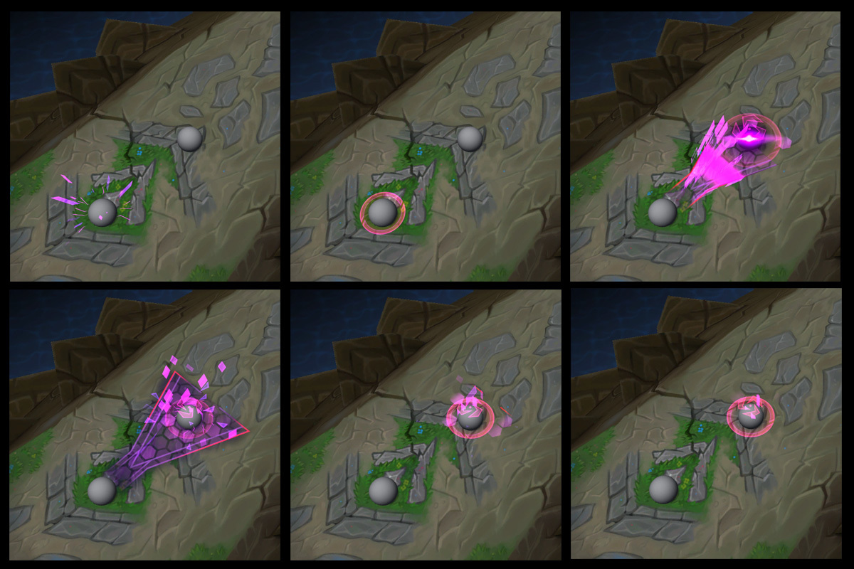
I liked the “triangular” particles in the Project series. I incorporated that as a “shattered” impact.
Maybe I should make the design some kind of “virus” theme (since she’s a dark child)?
Potential Ideas
Maybe blipping 1’s and 0’s for the burn-off? It would add to the “shattered” look.
Add some kind of thin circular spire around the stun indicator? Kind of like a simple circle loading bar (outside of ring)
@Travis Good idea! I’ll keep that in mind for popping effects. I usually have a fade-in/out for the pop, which is actually unnecessary. The eye can’t tell the difference haha.
Hey Folks,
Here’s a small update on my Fan-Art. I’ve been busy painting some WoW Weapon Fan-art for an upcoming side-project. Goblin stuff
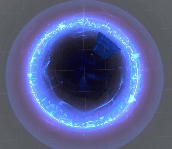
For the Ultimate, I imagined some kind of “pulse” as the indicator before the detonation. I added a burn-mark similar to Project Leona. Added some swirling sparks and a spinning ring. I used a ceil node with my alpha dissolve to give harsh edges to my explosion sphere (like hextech annie).
I do not own the Tibbers model and it will be replaced with a custom one. Tibber’s (c) Riot Games.
I’ve still got to add the other two effects and refine these ones.
For Annie’s E (Molten Shield) I’m going to re-imagine it as a “blink + shield” effect, where she teleport’s a short distance then has a fire-shield. I feel like she should have a built in flash, since that’s how she’s played often and it would add more mobility. FLASH NUKE!!!
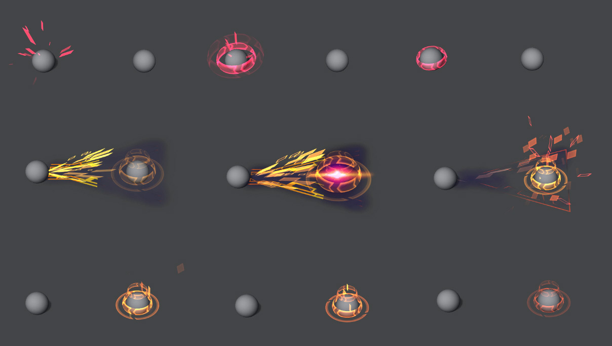
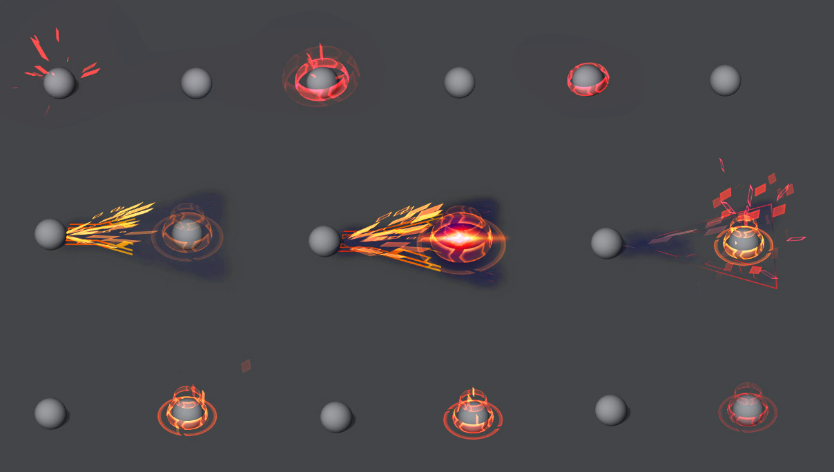
It’s been a while haha. Here’s the latest iterations on my Project: Annie VFX Fan-art. I’m still working on the first two effects (above).
[Auto Attack #1]
I’m thinking about ways to make this more interesting. I may try making it similar to the fireball with a smaller clump of particles and shorter life-time.
[Disentegrate #2]
I found this one challenging because I wasn’t sure how I wanted it to look. I tried a comet shaped mesh with panning squares but it didn’t look good. It felt like the simplest solution was the best in regards to clarity and continuity.
[Molten Shield #3]
Like I said before, it’d be cool if Annie’s Molten shield was actually a blink since its a crucial part of her play-style. It’s molten shield combined with a short distance blink (instead of dash/leap) since it feels a lot more jarring and akin to Annie.
Here’s some minor updates on my project. I’m still concepting Tibbers for the ultimate. Once it’s built and rigged, the remaining effects (auto-attack and fire passive) will be added to it.
[Auto Attack #1]
It’s now a digitized fireball. It has a cast and splash effect as well. Red makes sense since it’s a weaker projectile.
[Disintegrate #2]
A clump looks more chaotic than one main particle. It’s also red (even though more powerful) because it stands out more than bright purple. It also looks nicer imo. Small cast and splash effect as well.
[Molten Shield #3]
Added a darker backing since there’s now a glow for the shield. Changed the hue of the pattern. Made hex-burn more visible.
[Summon Tibbers #4]
Could be a lot of stuff going on. The triangles are there to add depth but may be too distracting. I’ll need to come up with a different looking “pulse” since it’s the same as the blink. There’s a short cast-period before summoning Tibbers.
I think I’m just going to use a low-poly mesh for the ultimate- mainly for focal and time-saving reasons. I traced over Tibber’s Mesh and created a primitive version. I did not sculpt it from scratch (however, I did model new topology and animate it).
The animation still needs work. I feel like I’ve gotten where I want to be overall. I just need to refine everything some more and I should be good.
Here’s an update on Annie’s Ultimate. This time around I rigged and animated the model properly. I included a death animation since it’s part of the cycle.
Really rad work here! Well done with that tibbers model/rig/anim too
Your effects are really awesome, I just think you could present them a little better to help give them justice. The background is really awesome, and I appreciate that you went out of your way to create a custom ground that appears nearly like SR, however it’s distracting me from the actual effects. This may be a case where a plain ground with some subtle grid lines would do. Or if you happen to accidently stumble on the actual texture like @Sirhaian does in his videos it may be more acceptable (but again, a plain grey ground with grids really can help compliment good looking VFX whereas fancy terrain will often only distract when not absolutely perfect). Also, centering up the VFX with the center of the screen may also help you with the presentation. Your VFX are all slightly screen left which throws me off before looking at your VFX.
As far as VFX are concerned I think you’re doing a stellar job! You’ve put lots of thought and research into nailing down your pallette and getting the correct shapes into your work. Well done! Just commenting on the first thing that caught my eye with your newest stuff are these particles coming off of Tibbers hands:
A general tip for when doing trails of things moving quickly, it’s very difficult to make it look good when emitting quads as the primary read/element as you have above (as secondary pieces it works great!). This is going into solution space, but try playing with ribbons/trails for things like this (swipes in general). They can help it feel a bit more smooth and will compliment the arm motion rather than fight against it, which is what large quads tend to do.
I’m really impressed by your progress colossaladvent! Really solid stuff . Keep it up!
@Sirhaian Thanks man. Awesome, I’ll definitely look into that if I need help. Yep, Annie is the best!
Hey Folks,
Here’s an update on the Background. Added a swipe mesh and removed background. The BG was originally there for the “correct” color and transparency (similar to Summoners Rift). Gray BG’s tend to make the colors flatter and more opaque (in relation to transparency/additivity).
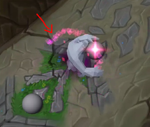
The one issue that really irritates me is the render order. Unity renders based on depth (AFAIK) and the Render Queue maxes at 5000. I’ve been having to place the particle systems above the mesh or using Z-offset to make them appear in front. I wish the particles would render through the meshes regardless of location.
The Z-offset causes the “death glint” to pop in and out instead of scale downwards. Does anyone have a solution to these issues? I’ve just been faking the angle since the camera never moves.
[quote=“colossaladvent, post:17, topic:2421”]
Does anyone have a solution to these issues?
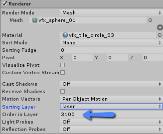
[/quote]I stack my FX using render tab : Order_in_layer, any help?

