Hey Folks, I wanted to share something I’ve been working on. I’ve been looking at the Blood Moon skins and thought it’d be neat to make one for one of my favorite characters. The idea is to have powerful “blood based” abilities using the Blood Moon color scheme.
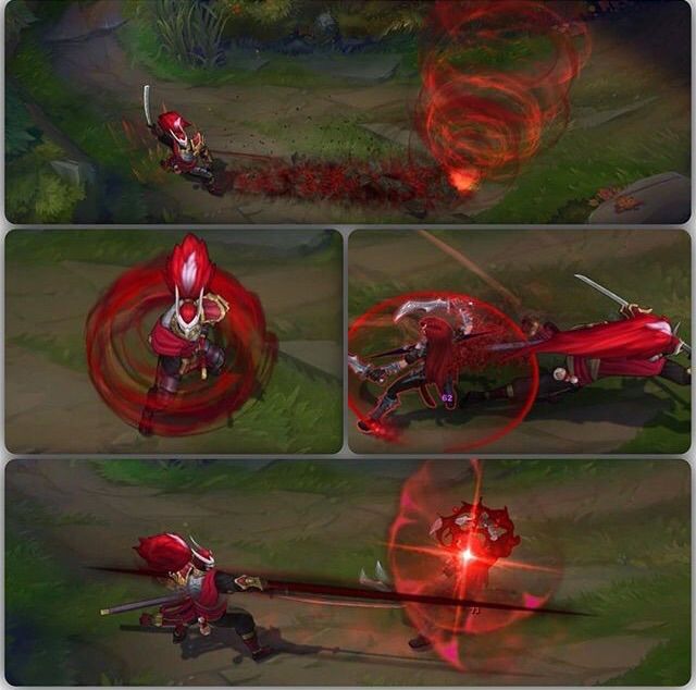
I’ve been trying out different color schemes, but red seems to be the most appropriate. Blue blood looked cool but didn’t feel as deadly (although the hottest flame is blue). Jhin’s Blood Moon skin has been a huge inspiration for the idea. I love how the FX breaks up smoothly. The color pallet is very nice too!
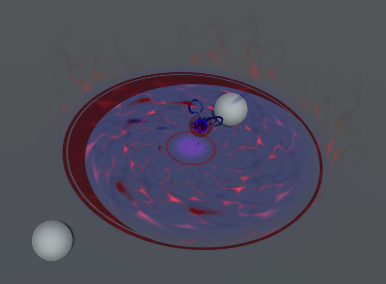
For this FX, I wanted to create an unstable blood ball (similar to Syndra’s dark spheres). The orb gathers energy while floating over a pool of water.
I’m working on making the explosion feel more powerful. It feels lack luster because its a liquid. It could also be because I added movement to the blood spray. What say you my fine friends?
Hey Folks, I’ve been working on Lux’s Ultimate for my Fan-art. I’m glad @Augie shared the ‘souler-coaster’ breakdown. It gave me a chance to fix an issues that’s been bugging me for along time.
For this ability, I used blue because it makes sense. It has the highest contrast and blue has a ghostly mood about it. Overall, I’m trying to keep things fairly de-saturated but not gray scale.
I’m working the Arcane circle’s timing and design. It also has some visibility issues, making the circular wipe hard to see. The circular wipe was based on the Elementalist Lux skin.
I was thinking about adding a “blast wave” coming off the edges of the circle. Right now it’s just an aura.
You could try to make some of the elements start faster and slow down over time, to have more of an explosive feeling. Depending on what engine you use, you could use drag to create that kind of movement.
I like your choice of colors, but not the way they interact. It feels like both colors are fighting for dominance which creates a lot of contrast, but it lacks coherence.
The dominant color in all blood moon skins is dark red. So this should probably be reflected in this skin aswell.
You could try to make the laser fade to streaks of dark red after it fired, and make the runes which linger, small lean glowing blue runes?
The first beam of the ult (I think the one used in game to signify theres something coming) should be smaller in my opinion, or less fussy. Maybe you could add a pattern to it to make it more interesting?
I do like the impact of the laser itself. It feels strong and impactfull. I can easily know as a player that I shouldn’t stand in that.
I like the runes which are visible after the laser. Altough after doing some research they don’t really fit with the theme of the other skins (Unless theres some skins I haven’t found). I feels like you went for some hybrid between bloodmoon and arcane. (Which I think is really cool, so in my opinion you should keep the runes )
Most of the bloodmoon skins too me feel like this kind of color palet. (Mostly dark red, with the highlights being a different color).
@Niels Hey man, thanks for taking the time to break down the pallet! I was too focused on the contrast instead of the dominant pallet for the laser. I’ll remember to keep the ratio in mind haha. I was looking at this for reference. It’s really nice that they have stills for all the skins.
Alrighty, here’s the latest iteration now with Prismatic Barrier. I was looking at the Blood-moon Diana shield for reference. I really liked that sheen effect on her skin. I wanted some kind of “tether” between the orbs as they spin around. Possibly red lightning tether? Or maybe some kind of liquid tether (panning UV’s)?
Note: I wish there were “camera facing meshes” in Unity since it’s a lot of work to try and rotate the mesh towards the camera.
Made changes to Final Spark’s tone. It’s got a purplish red tone to it. Shrunk the runes and converted all other colors to red tones.
Added some “spire wires” (souler-coasters) to the Luscent Singularity. On detonation, I was thinking some squiggly lines would erupt violently. It still needs work, but I’m trying things out. Added a light ring and light particles to the burst, now it has more impact.
I’m working on Light binding and the Passive. I was thinking that it would be cool that the fire would substitute as a lens flare. Sorta like a fiery curse mark. However, I’d need to make actual fire brighter or a different tone (blue?) to differentiate. Alternatively, creating another “evil aura” effect as seen on the first ability would suffice. What say you?
I made some adjustments to the timing for better precision. I’ve also been trying out some ideas for the ribbons and tether. I want to incorporate more brush strokes for that oriental feeling. That and the “blood magic” aspect as well.
I’m still thinking about the design for the projectiles since they feel a bit bland. I’m trying to figure out the proper brightness since the pallet is red. From what I know, the two brightest/saturated colors are cyan and yellow. Unfortunately, saturated red doesn’t feel bright or powerful and bright values don’t feel like “blood magic”. I’ll have to think on that since I can’t use blue (too dominant).
Also, sorting issues are an irritant. ShaderForge/Unity don’t seem to allow sorting for meshes. There’s also this weird cut-out problem where particles that overlap will subtract from each other creating holes. I’m not sure what that is.
First of all, you should definitely try posting it on the League of Legends Reddit. The community will most likely give you a ton of great feedback regarding the theme and the gameplay readability.
I really like it, so far, especially your colors. If you don’t mind though, here’s a list of feedback I have for you, based solely on this last 3.0 version.
Passive:
The icon’s border looks too thick when compared to her other icons. Try making it 1 or 2px max.
The smoke seems to be sucked in by the target after a few frames. Is it intentional? If not, try to avoid it. Make it disperse or simply fade out over time.
Really enjoy the broken parts on the ground! That’s a good idea, and it looks good.
The passive proc could use a better timing. Try to make it faster at the beginning and slower at the end. It’ll help sell the impact.
Basic Attack:
It looks really cool, but maybe the “petals” (?) are going a bit too much outside of the projectile. Keep in mind that this is “only” a basic attack, so try not to make it too large (still hurts a lot, though).
You could try adding a glow at the tip of the projectile? It usually adds a lot, especially considering that Lux is all about light.
Try to add a small cast effect. For now, the projectile seems to come out of nowhere, which looks a bit sad. :c
Q: Light Binding
Same as the BA, it lacks a casting effect. Even just a small one could help.
I can’t say for sure, but I think there’s a hit impact if the cage hit? I’d need to check Lux again. Please ignore if that is not the case.
The Top/Bottom parts of the cage appear in a very sharp line. Try to fade it out a bit, or add some noise.
The projectile’s tip’s glow look a bit too sharp, imo. Maybe fade it out a bit?
Absolutely LOVE the main trail’s shape!! The only feedback I’d have for it would be that it seems to “slip away”. Do you have a panning shader for it? If yes, try to adjust the speeds so that it “stays where it spawns”. Not sure if that makes sense, ask me if you need more explanation. ^^
The Top/Bottom parts of the cage seem to be in alpha blend, while the cage cylinder seems to be additive. Intentional? Try to make it stick together, maybe by adding an additive element to the caps, or an alphablended element to the cylinder.
Try to animate the disappearance of the cage, maybe just by adding a scale up? That is nit-picking, but I’d love to see that.
W: Prismatic Barrier
Once again, absolutely love the trail, and also really love the shield shapes and colors! It really reflects the BM theme very well.
However, I feel like the outgoing energy arms/vortex of the shield might be a bit too big. Just a personal opinion, but you might want to try to make it just a bit smaller.
Her shield projectile is always very bright (as in I have to catch it if I want to be shielded), so maybe try adding some glow to the both extremities. It’ll help the players identify it as her shield ability.
Try adding a 1-frame flash when her shield reactivates, just to see how it looks. Right now, her shield (re-)activation seems to lack a bit of punch.
E: Lucent Singularity
I like the idea, but it feels a bit too low-powered for something that hits like a truck.
Try to add some coherence between the initial projectile and the aoe’s first frame. Right now, it is clear that you destroy the projectile and spawn something else. Instead, try to make it look like the projectile “expands” and “becomes” the area. Try to make it so that the projectile (or at least something that looks like it) stays in place once it reaches its destination.
The charging blue color seems a bit too dark for me. Try adjusting its value, and maybe its hue too.
I like the motion you have going in the center, keep it.
For the aoe’s area itself, maybe you could try something similar to the BM Zilean’s bomb aoe: you can see the moon’s shadow move over the aoe as it charges, and once it’s about to explode, the shadow completely darkens the area. Try something similar.
The sparks you have are waaaaaaaaaaaaay too fast! They appear and disappear in a frame! Try to show their motion and lifetime, at least for a few frames. Here, they just seem to blink in and out.
The explosion is good, but I’d like to see a little change for the blood splatters on the ground: in most anime, when a samurai cleans its blade with a fast movement, you see the blood appearing super fast on the ground, but it is never instant: it’s generally in 2-3 frames. The closer to the center, the faster it should be. Try to delay some splatters by just a few frames.
The explosion colors could use some… colors. Try to avoid full white. Maybe some light blue?
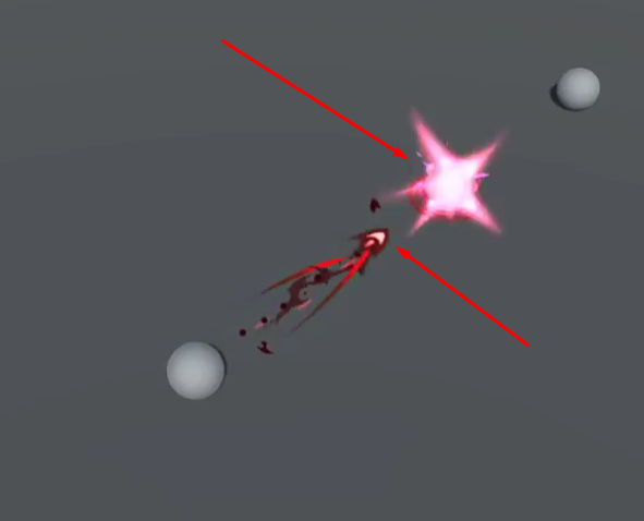
R: Final Spark
The ultimate is the best part! I really love it!
The runes could maybe be scaled up a bit. They are barely distinguishable for now.
The ground texture could use some variations, imo. Maybe add a random noise on it? Also, try to make sure the center seems “hotter” than the rest. As if the ground has been scratched out of existence by the sheer power of her mighty laser.
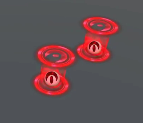
Her ult always features two lights rotating around the point of origin of the ult. Adding this will help players identify whose ult it is. And also: distortion. :3
The movement of the ult’s origin (the runes/shapes disc) has a strange motion. I understand the thinking behind it, but when watching it over and over again, it looks a bit weird, as if there was two motions, where there should ideally only be one: charges in one direction, discharges in the opposite.
Her ult’s anticipation line is barely visible. Try to make it a bit brighter?
I think that’s about all I can find for now.
It’s looking really good already! Can’t wait to see how far you’ll take this!
PS: About the particles that overlap and cut each other, I tend to have the same issue when my shader allows for distortion. Not sure if that would be the case for you, but just in case…
That’s a good idea! I’ll look into posting there. For everyone else- I’m always open to critique/feedback, don’t feel bad- I love harsh critiques (it’s the only way to grow haha)!
And as always, thank you for taking the time to get in depth. I’ll definitely look into improvements!
Passive ~
Yea I’ll fix the border width. It’s tricky when readability is a factor (not too thick n’ not too thin!).
The smoke is acting weird, I’ll add a speed modifier and double the size by life (expansion).
Thanks! It’s like a blood splatter. “Blood theme” haha.
I’ll work on the timing more. Gotta use that smooth step towards the end XD.
Basic ~
I agree. I’ll reduce the amount of petals and keep it within the line. Gotta differentiate it from the rest of the abilities.
That’s a good idea. I’ll figure out a design for that.
Yea I see what you mean. I saw your Dark Star Lux had a small glint before the projectile flies out. I’ll keep that in mind!
Light Binding ~
Gotcha.
Yea it’s probably a good idea. A glint of light would be best.
Ok I’ll fade out the tip some more.
Yea, for my trails I use a panner node. I get what you mean by slow down- so it looks like it’s being drawn out slowly.
Yep, most of my textures are Alpha Blended with an emissive multiplied against them (value 3). It’s the only way I can get special effects like alpha wipes or dissolves. I see what you’re saying though, I just recalled someone mentioning “too opaque for League” on one of your works, but yeah it’s probably too flat in my case haha.
Sure thing man! Gotta give it that pop right? Can’t have that boring fade out haha.
Prismatic Barrier ~
Thanks, and you can thank the awesome artists as well for the inspiration!
Ok. Yea, I’m having some trouble gauging size since they’re just spheres. I’ll look into that.
Alrighty. I’ll probably make the projectile interior white like the default skin. Maybe even cyan since it’s a small detail and that’d look nicer.
When you say flash, do you mean speed up the sheen? Or do you mean have some kind of rapid burst effect. Either would be interesting imo.
Lucent Singularity ~
Alright. It’s probably the aura as well (stays constant entire effect). I’ll figure something out!
Yea, I made a “deactivated” orb that scales down before powering up. I could probably just have the projectile start small initially then scale up. That way its one motion instead of 2.
Sure, fixing the charging color is a quick fix.
Yea BM Zilean’s shadow would be interesting. I’d probably remove the static blue shadow in place of the moon shadow. Gotta love that UV offset!
Ahh, woops. I’ll increase the lifetime and gradient so it doesn’t flash like that.
Hmm, I’ll have to figure out the timing on that one. In the older iteration the blood flying outwards didn’t look good. But you’re right about the movement not being instantaneous.
Ok, I’ll add the cyan back in.
Final Spark ~
I Appreciate it! Elementalist Lux was a great resource for that idea.
Yes, I’ll scale those up and increase the lifetime a little more so it lingers. It dissolves too quick.
Gotcha, kinda like a scorch mark. I could probably mix it in with the caustics.
Interesting. That’s probably the staff part I missed. Yea, I’ll need to add the nice distortion touch. Gotta make some Normals for that.
Hmm. I see what you mean. I was going for that “blowback” effect since the disc is supposed to move forwards over time. I’ll probably have it blowback (one direction) then disappear instantly without any recoil.
Sure. The upload quality probably has something to do with that as well. It’s a desaturated red on a gray surface :/.
Alright, back to work now haha.
Smiley’s are nice!
Made as many suggested changes as I could, added brush strokes as “cast effect”. Added wind impacts to target. Added dual lights to Final spark w/ a return orb. Added distortion to Lucent Singularity and Final Spark. I made the projectile sharper because it matches the trail and has a more sinister feeling (you don’t want to get caught by it).
There is a delay on the wind impact for Light Binding. I’m seeing how that looks. The rest of those match the impact flare. I removed the caustics on Lucent Singularity since I couldn’t get the panning speed to feel right. Blending a fast movement over the slow one looked bad. It’s unfortunate that I’m unable to control the panning speed via curves (in Unity and UE4).
Below is an image of an issue with sorting and cut-outs. I notice that it’s subtractive with any type of particle, even within it’s own system. It’ll act as a cut-out or difference when two particles overlap.
Meshes also don’t abide by render queue in terms of what’s in front. Meshes use depth blend which negates the render order unless the particle system is in front. You could set a trail to 5000 (max) and it’ll still render beneath the sphere. You can apply a SF material with the Mesh’s Render Queue set to -1000 or 0 and it’ll still render any objects behind it. I’ve worked around it using Z-offset on some things and moving the particle systems in front of the mesh.
I feel like I didn’t have these issues before in the previous version of Unity- or I didn’t notice them at least. Strange huh.
The Basic Attack’s hit has a slight timing issue. I think it might have something to do with the glow. Not too sure, but I think the glow lasts a bit too long. Try to make it last 0.1s.
The Q should avoid having an arrow-like shape for the projectile. It might be confused with, for example, Varus’ Q. Also, I believe the range is bigger, and it can go through 2 units. I do like the cage, but I liked the flash/color variations you had before on the caps.
I’m not too sure about the W. I’m not a fan of the texture and color you used for the ends of the projectile. I also think the shield’s aura is a bit too big, too.
The E is better too! Maybe the outside fumes are a bit too visible, though. And the sparks are still too fast, we cannot see their motion.
We still don’t see any rotating glow in the R. We do see some kind of wand, but that is only barely visible, if any. Try making it really bright and last the actual length of the cast.
I really like the shape of the ground decal, but it seems way too wide. Try to make it smaller. The disappearance is nice! I also like the little motion at the end of the ult, with the orb moving.
Alrighty, here’s the latest update on my BML Fan-art. Made the suggested changes as best I could. I feel like I’m close to the end, but I’m not entirely sure. I really want to push it, so if I’m not where I need to be, I’d like to know! Any recommendations? I could use some inspiration!
For the Q, I made the projectile rounder and broader. I added a second target and increased the brightness/tone of the caustics. I added an aura to the marks as well as a red glow. All Impacts are 0.15 seconds now.
The W and E have been a bit troublesome. The W’s projectile glow should be the correct size from what I’ve seen. In reference, it’s very transparent/subtle. However, it would be challenging to see with my gray background (that’s why its brighter right now). I couldn’t think of a good design for the projectile orbs since its always in motion. I’ve tried rotating designs and different patterns but none of them looked good. It seems to me a basic design is just fine since it has the highest clarity.
As for the E, the sparks should be more visible now. The timing is a bit challenging since I’m using Limit Velocity in relation to opacity. The lifetime is around 0.7-0.8 and it becomes opaque quicker (so it still keeps it fast speed but disappears faster). The fumes are half their opacity now and have an increased lifetime (otherwise it vanishes instantly since it’s not as visible anymore).
For the R, I brightened the orbs, fixed the channeling time (was previously 0.5 instead of 1) and squashed the scorch trail a bit. From the top, the line matches the scorch so it should be the correct width, aside from the jagged pattern. Do you think it’s still too wide? Thanks!
Just have some last feedback, if you are still interested.
The Q cage appears way too early:
The W looks slick! Love it!
Still the sparks issue on the E (still popping in and out), but the blood looks better, imo.
You should have a look at how I set up my sparks in Dark Star Lux’s E. It might help a bit.
The R is better too. I’d accelerate the two glowy orbs, though. The ground scorch mark stays a bit too long, it might be misinterpreted with Corki’s package.
Ahhhhhhhhhh wow, I missed that one big time. Thanks for pointing that out. Yea, I’m always open to feedback!
Certainly, I’ll look at your example. Are you referring to the explosion sparks or the “energy drawing” sparks? The energy drawing sparks pop in and out since its lifetime is really short. Just to make sure I understand exactly what you’re saying. If that’s what you referring to, then I misunderstood initially and that should be a simple fix.
Ok, I’ll speed up the spin. I’ll fix the timing on the scorch as well (it’s about 4 seconds).
Aye, good isn’t good enough haha- I gotta leap for that GREAT~ work!
I’m referring to the energy drawing sparks.
Even if they are supposed to be fast, the way they appear now completely removes their motion, and so we cannot identify that they are being drawn in by the orb.
I’m sure you can grab the “Great” title easily. Just keep going.
@SirhaianGreatness is only a matter of time! @Keyserito Hey man, what do you think so far? I’d like to hear your thoughts.
Alrighty, I should be at the end of the wire now. Made adjustments to timing and some small texture updates.
On a side note- the reason I missed the timing on the snare is because Unity’s timeline uses seconds (value 1.5 = 1 min 30 seconds). I’d type in 1.3 instead of 1.5 in the particle delay and it’d be off. It’s a bit strange how the particle system values relate to the timeline. Kinda throws me off.
Something I noticed is that my Lucent Singularity’s blood splatter creates contrast with the petals at the end and gives it this interesting camera effect. I think its called “miniature faking” since the center is the crispest. Good? Bad? I think its neat.
I don’t plan on doing a recall or death animation since I don’t have the character models (not sure if that’s legal either). It’d be cool to learn some basic sound design though. Outside of that, I’m ready to move onto the next project. I was thinking Teemo, but I should probably try something else. I do love those explosions!
P.S. Camtasia’s export quality is like a potato chip. I’m going to re-record in OBS and export via After Effects for the final render.
About the character models, I believe that as long as you credit Riot Games, only use it for fan art/training and do not redistribute them, it should be fine. Better make sure with a Rioter, but I wouldn’t worry too much.
If you have an Nvidia graphics card, you can use ShadowPlay (now renamed to Share, I believe). It works pretty well.
Hey man I really like your progress so far on this! I am defenitely feeling the “blood moon” thematic with your color scheme and shapes. There’s one thing that really sticks out to me that I feel you could put a bit more variation into:
Right now it feels very flat, with the same very saturated and high value color. It would go a long way breaking it up with some slight value and hue shifts.
I love seeing all the work you put into this and thought! Keep it up man!
@Sirhaian Ah gotcha. I think I might add the audio for the FX so it’s more interesting. As for ShadowPlay, that doesn’t work well on my computer. Thanks for the critique btw, I really appreciate it! @NateLane Thanks! I made some hue/value shifts here.
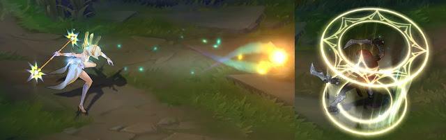
Below are some reference images I found. The first image’s rings interior/exterior both look additive with the pattern being a slightly lower opacity (possibly 70-80%). Is that what you’re referring to by slight value shift? And yea, red burns my eyes but that was the predominant scheme. It’s kinda tricky to find the right color brightness without using blue or yellow. Otherwise I’m stuck with darker colors which don’t look like light at all.
Also, should I add more colors like the second image? It’s got a variety of stuff going on but I don’t want to detract from the theme. Are the rings colored additive with colors blended over it for a hue shift? Or is it an emitter that emits different colored rings?
Alternatively, I could try a different type of mesh to give it a more volumetric look. Kind of like a flat cone or something. It’d encase the enemy in a capsule like shape.
Just one thing: the disappearance of the cage is a bit too brutal now, it almost looks like a damaging aoe. Try to make it scale a bit less at the end.
How’s this? I reduced the scale over life by a bit. Do ya feel it still pops too much? I’m too into that snappy animation style haha. The idea is that the target is being constricted before the pressure releases.
Yeah I love snappy animations too, but sometimes it can interfere with gameplay readability.
And it already feels better this way! Could you try adding a ground texture as background? The SR’s mid texture would most likely be a good way to judge if the values of the skill are correct.


